Foraging for Fairy Palettes in the era of maddening enli……
My annual task arrived; to design a new piece of illustration poster work for Open Boats Day 2026. And with this self-appointed brief comes the crippling indecision. With poster and cover art, for the past two years, I’ve attempted to stay within a set of stylistic constraints, not because I want to feel limited, but quite the opposite……I have a brain that is more creative once you build some walls up around me. Otherwise, my tangential instinct will have me failing the deadline. And my ‘walls’ are perhaps a little dry-stone. No cement, just relying on structural integrity……

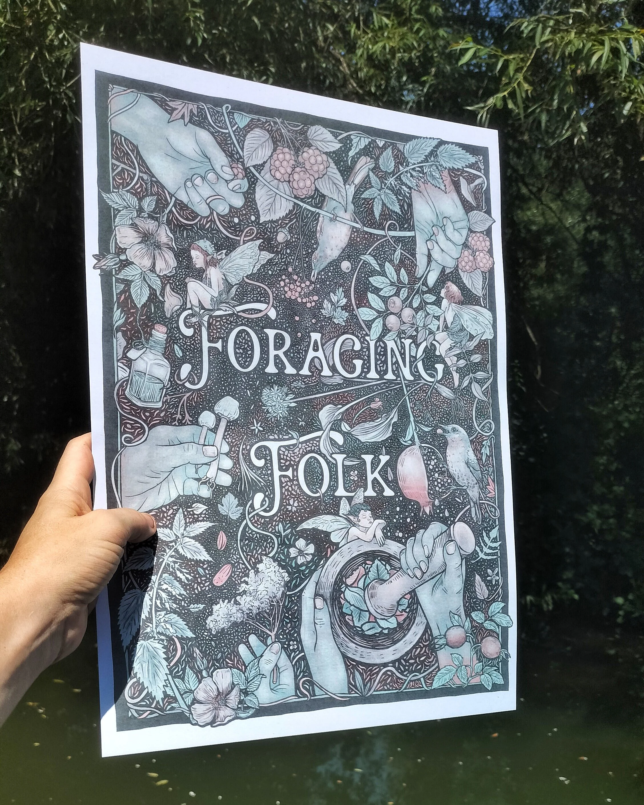
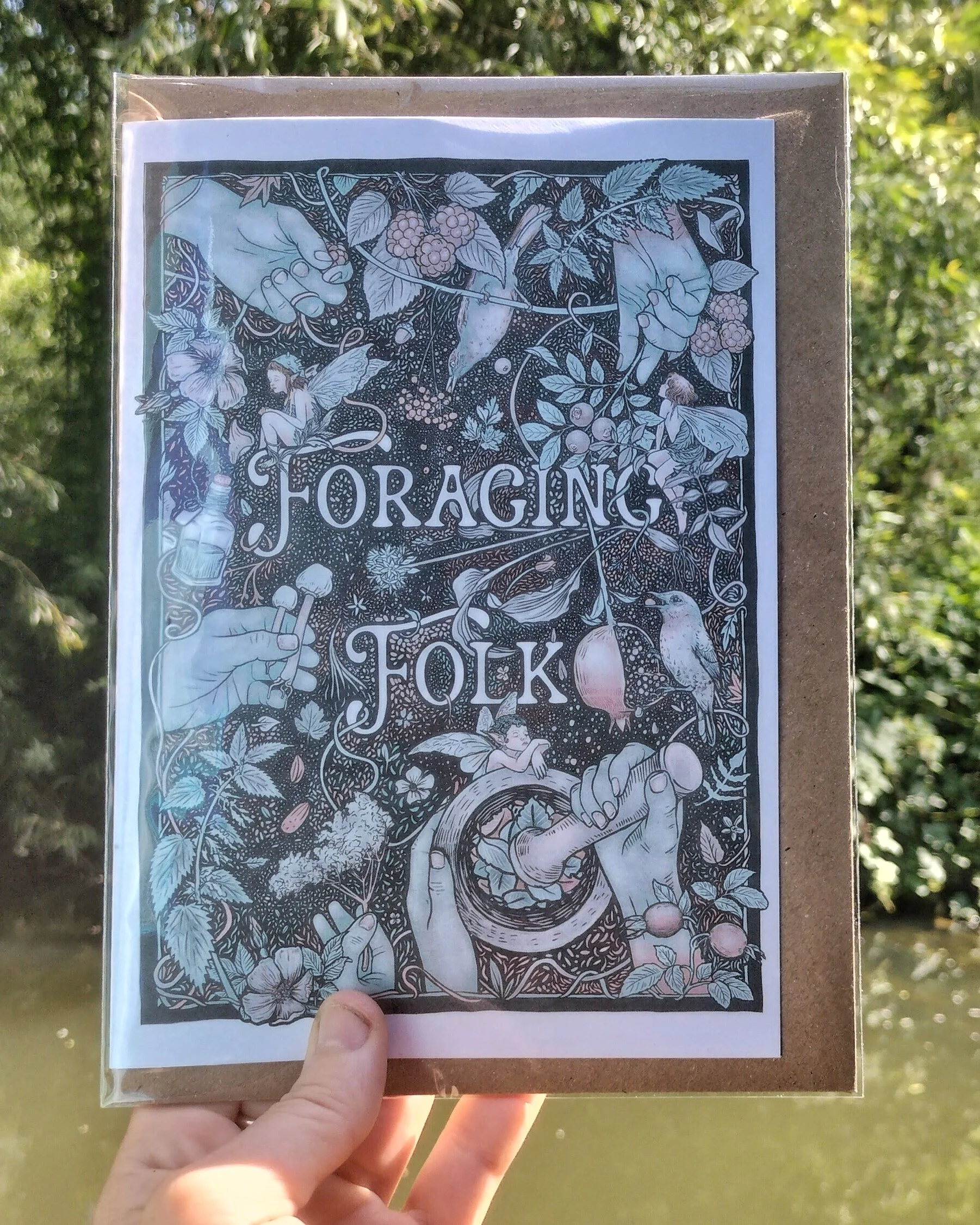
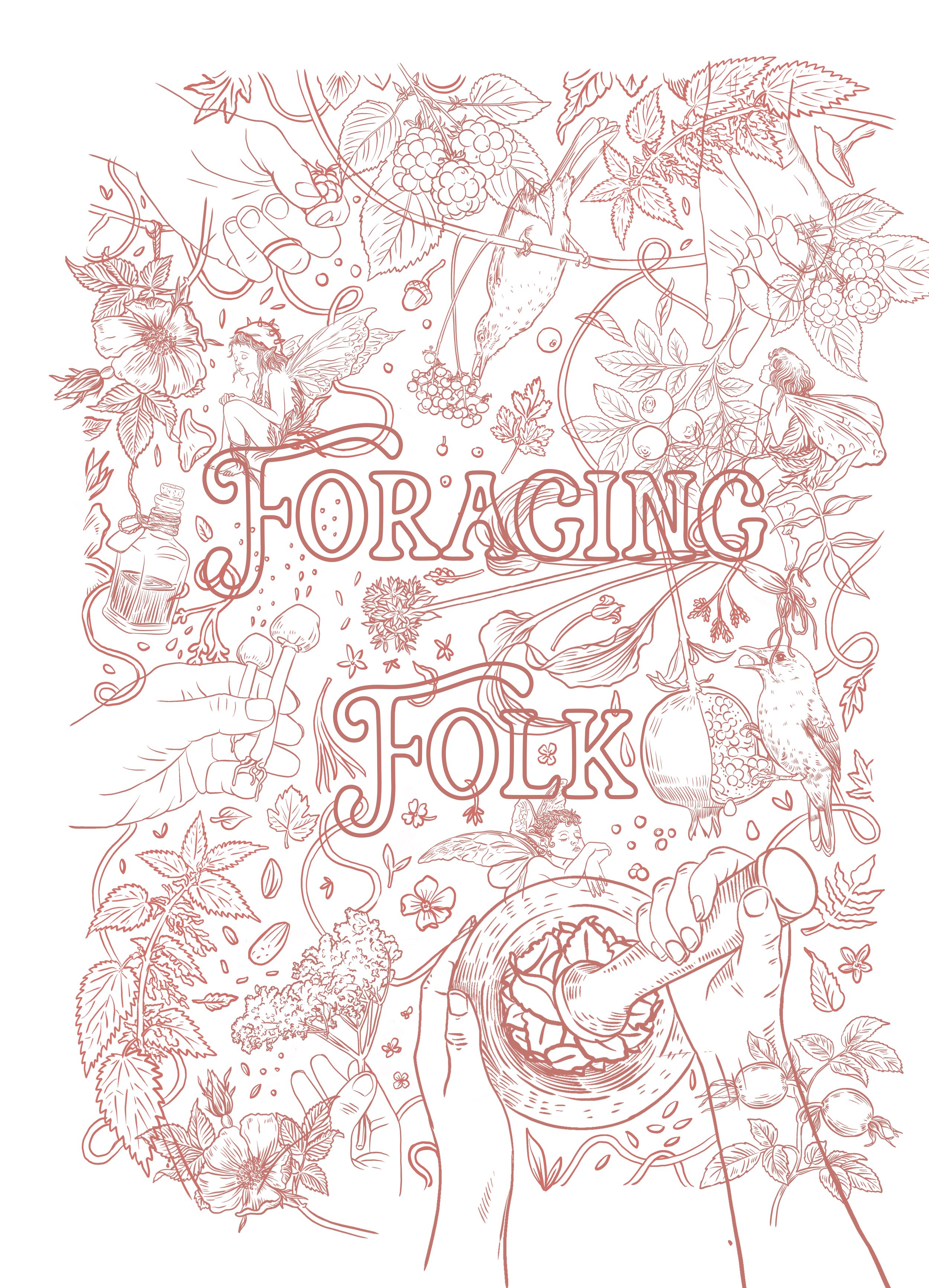
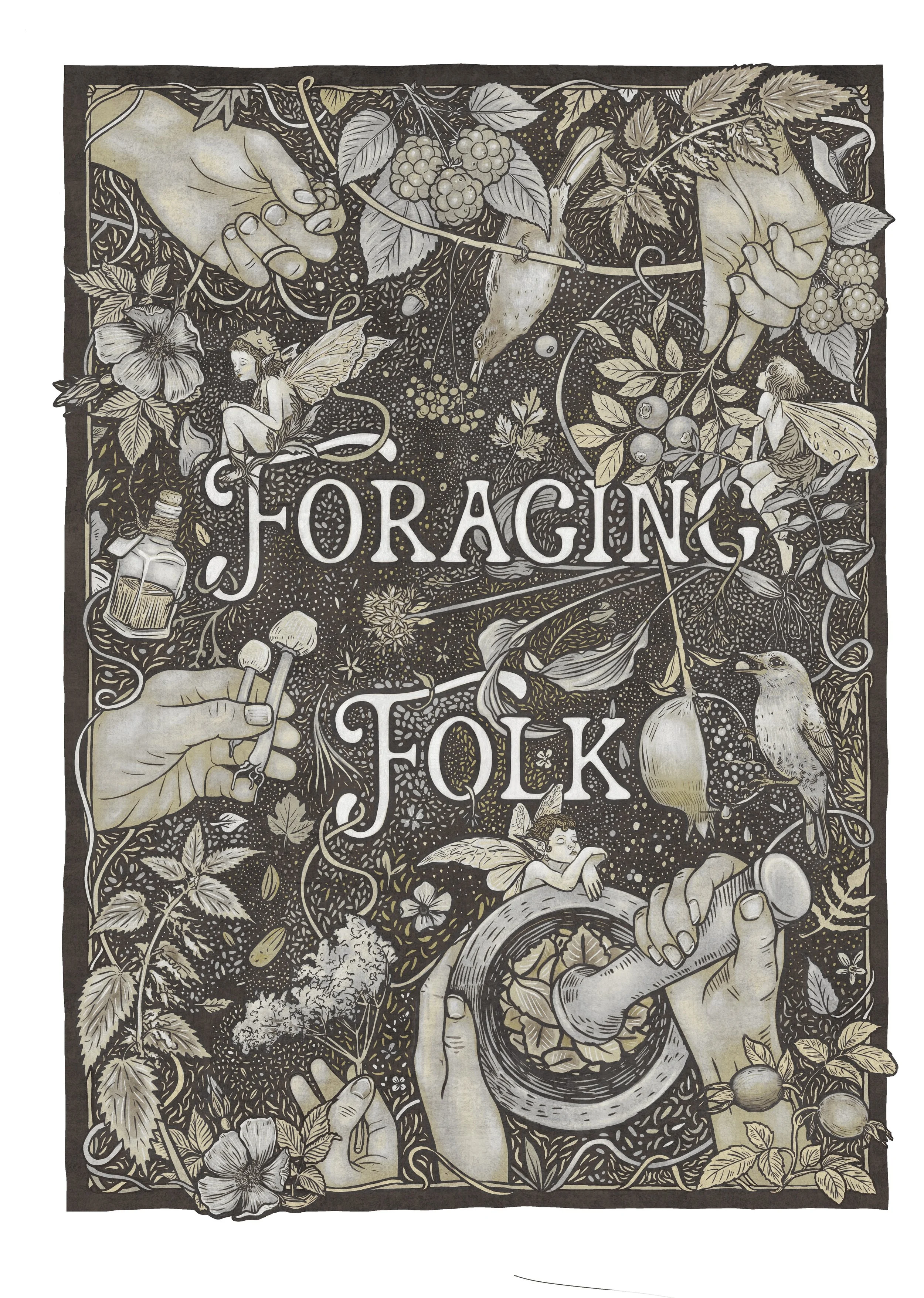
Foraging Folk Poster Design
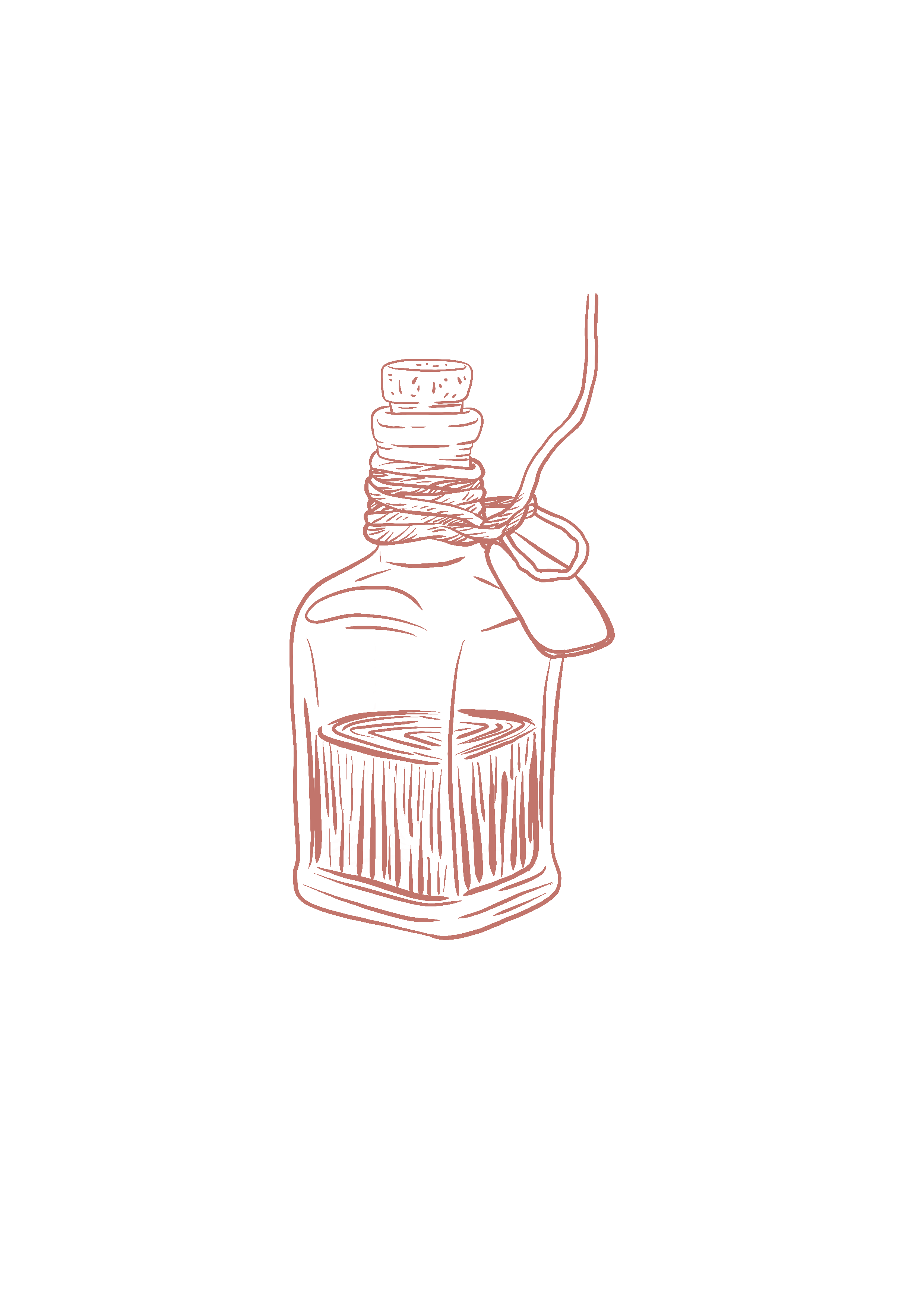
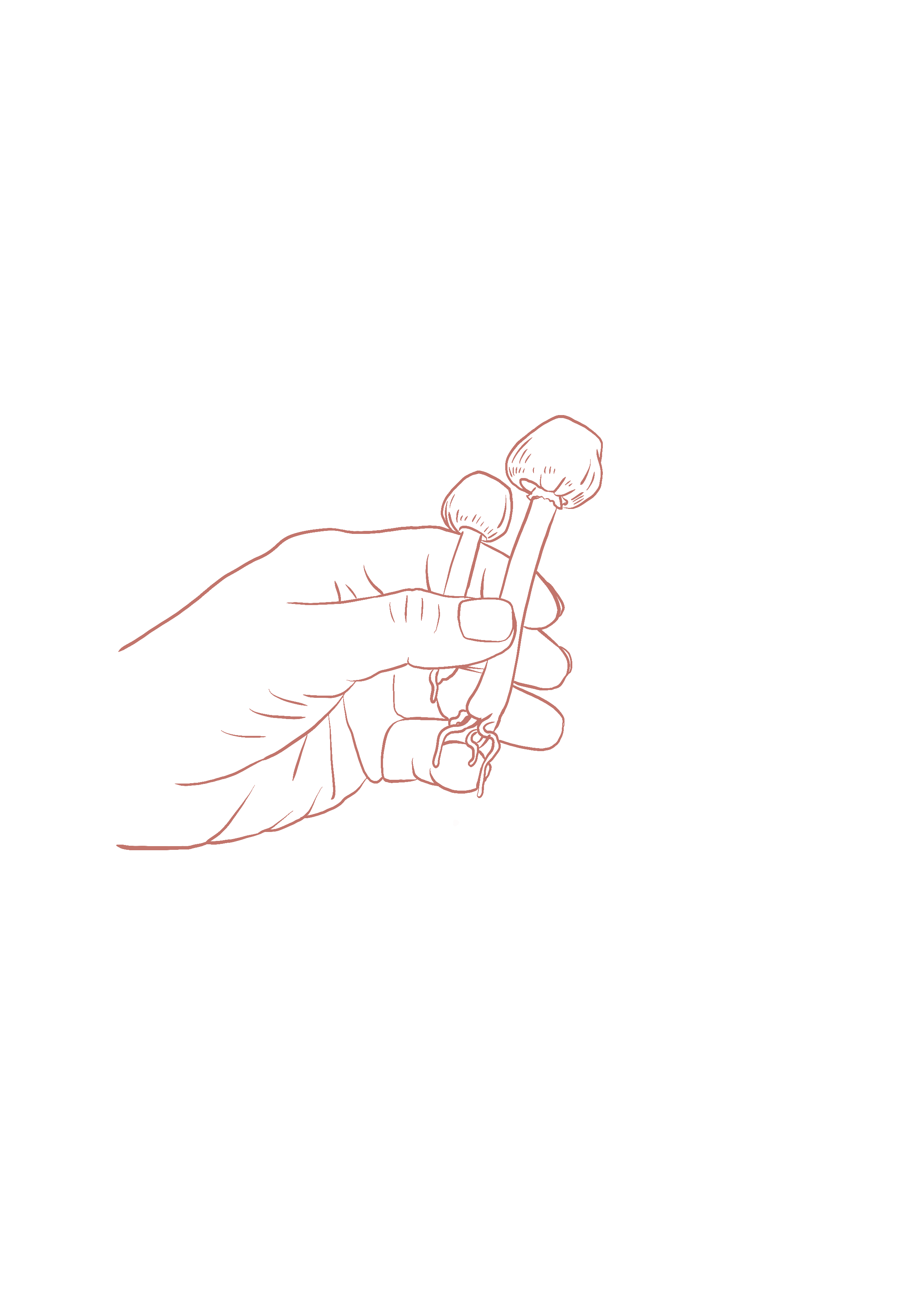
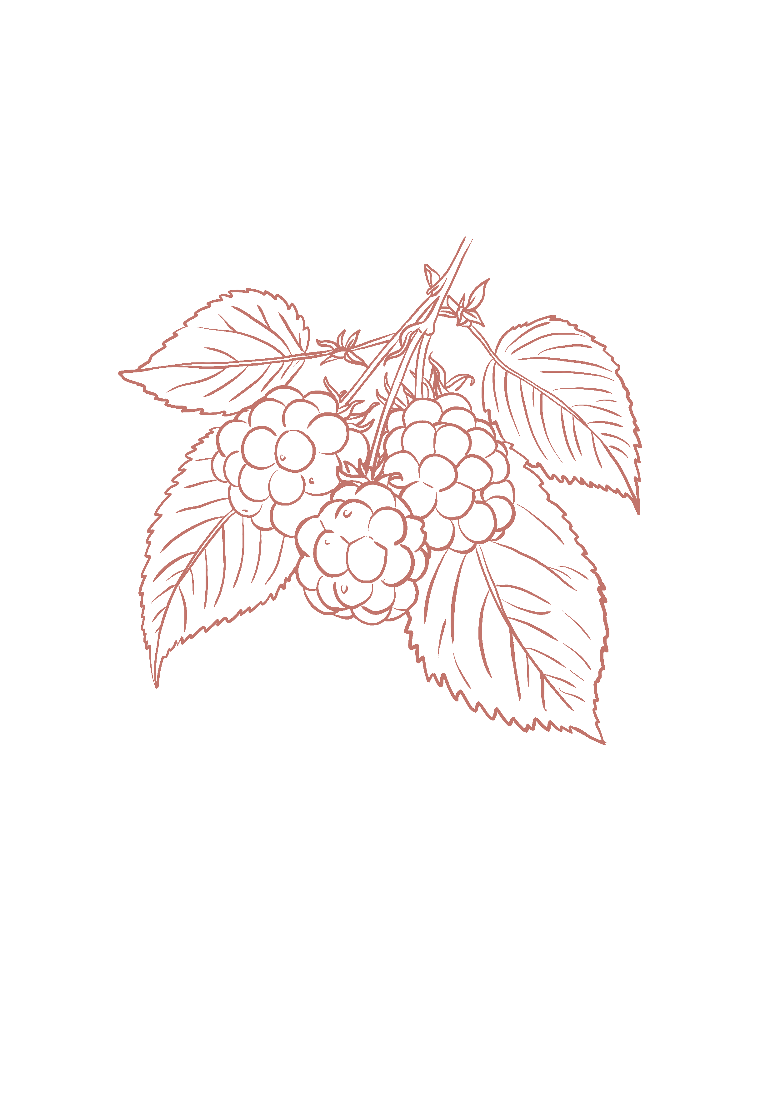
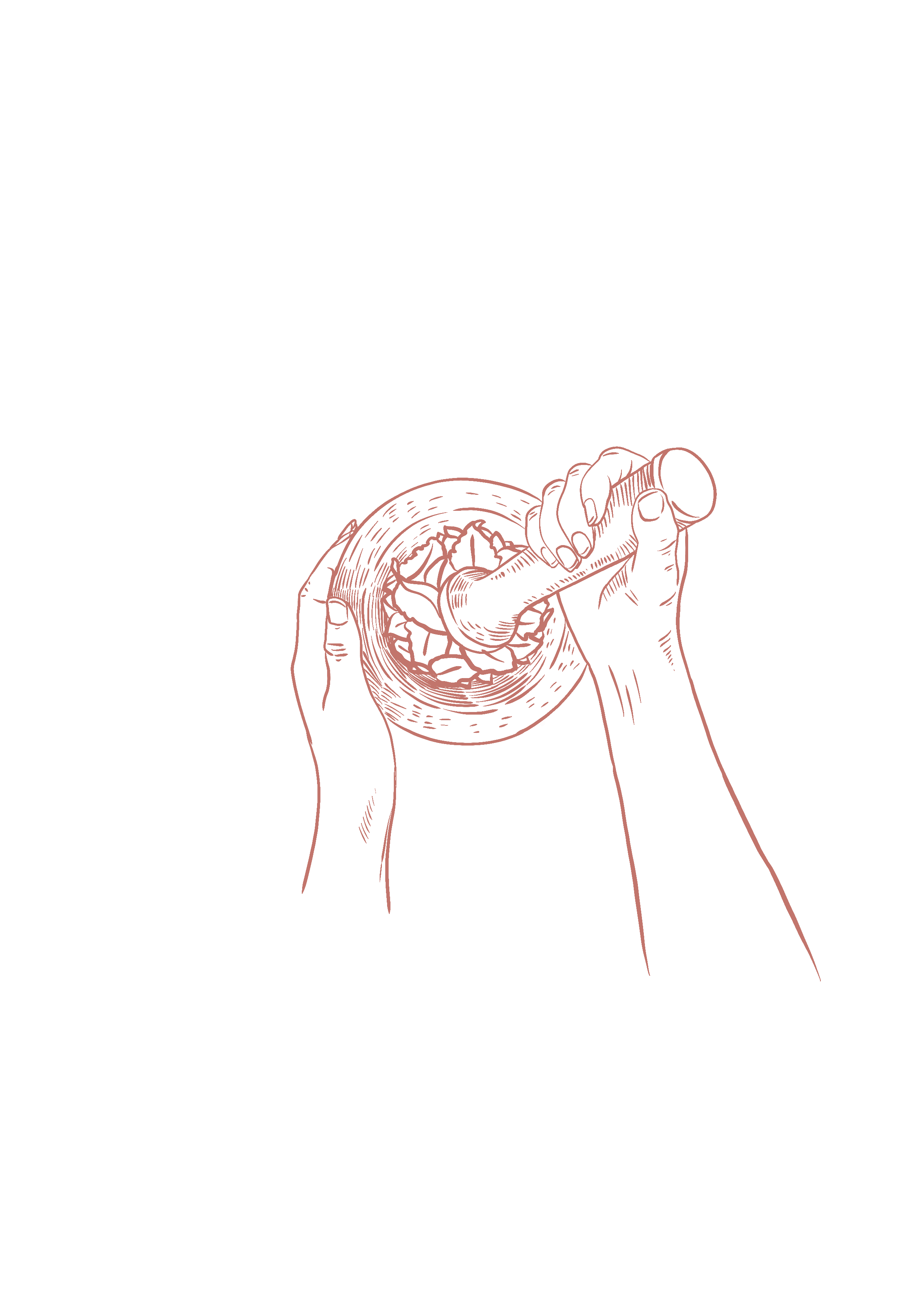
Subject matter; what am I drawing? Might seem an obvious question, but this definitive list makes searching for references and influences far quicker than going in entirely cold. Each year I give myself a main ‘theme’ for personal work, and whilst this isn’t set in stone, it is very useful as a springboard for new projects. ‘Plant lore, folk ritual, and the liminal’ is both specific and broad- I could explore this no end. I knew I wanted foraging hands, all sorts of interesting nuts, seeds, plants, fungi, botanicals- lots of nature, including birds, and a few fairies, to add some magic and folkloric story. And so the great bungee jumps down rabbit holes began, but with my feet secured firmly within my inspo silos…..
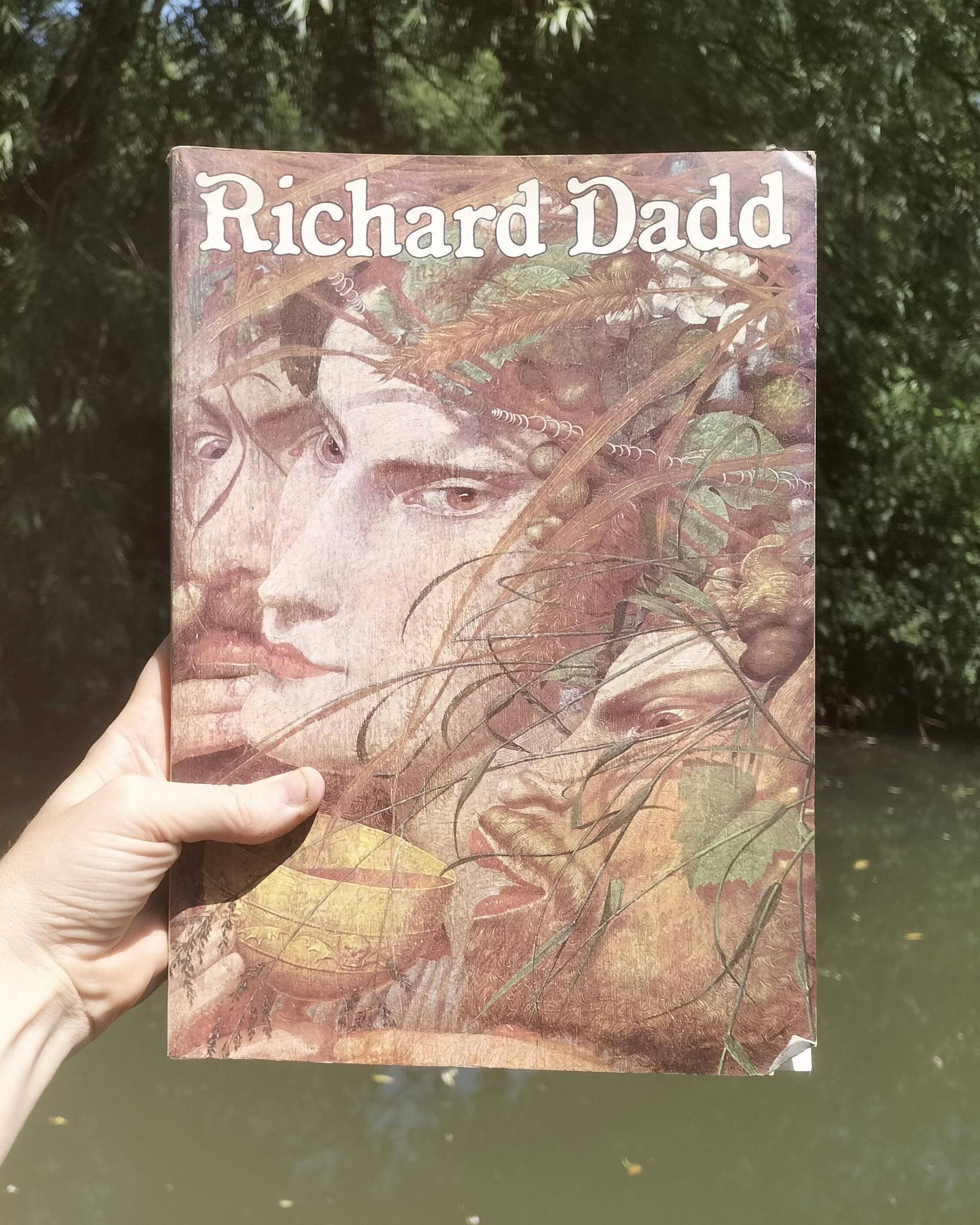
Fairylands; I have an old coffee stained copy of a Richard Dadd art book which belonged to my grandad. (One of many he used as references over the years). Other than the astonishingly bonkers life Dadd experienced, which keeps you pretty gripped, it’s also full of glorious paintings and if you’ve ever seen his more fantastical creations, you wouldn’t be too surprised to find out his most visionary masterpieces were made whi,st he lived in Bedlam, where he was institutionalised after a mental breakdown and killing his father. His attention to detail, with obsessive flora and fauna, all woven into quite mad compositions, are hauntingly epic. I love the supernatural flavour as well as the specifics; it makes me wonder if he truly did meet these fairy folk-from each tiny coat button to a blade of grass, it’s painfully accurate in displaying things that should not exist….
Decorative Design; elaborate borders, filigree, botanical motifs, NO WHITE SPACE! This is my cuppa, all of the things, everywhere!
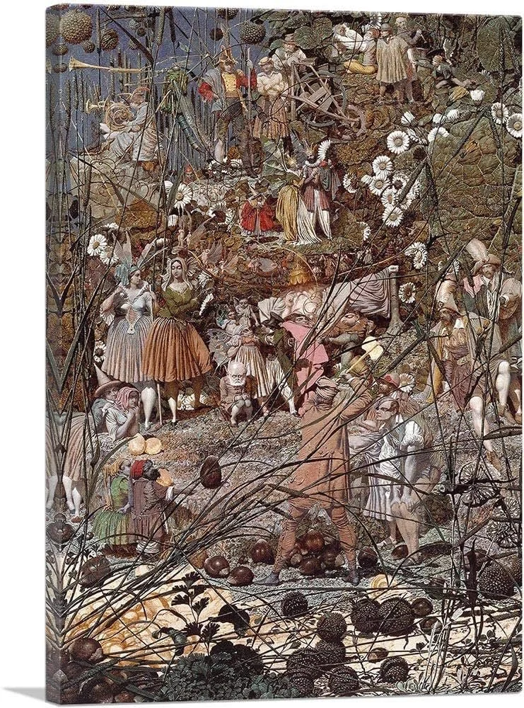
Richard Dadd ‘The Fairy Feller's Master-Stroke’
Another Richard, this time Doyle-and another Victorian illustrator (this era of enlightenment also had a dark side which I think is absolutely encapsulated in these fairy depictions) Doyle combines the scientific inventive attitude of the period with imaginative whimsy. Very accomplished draughtsmanship combined with dreamy watercolours…… a little bit magic that-I love this particular painting, looks like a hoot, all the tiny folk and bird friends riding across the water, straddling lilies and living their best liminal lives…..I REALLY like the frog-backed fairy watching from the riverbank, beautifully shadowed in contrast with the ethereal light poking through the bulrushes.
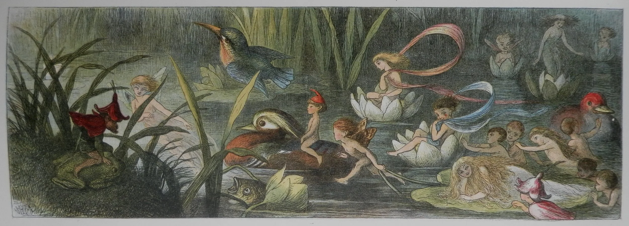
Richard Doyle ‘’Water lilies and water fairies’
Cicely Mary Barker’s Flower Fairies; I grew up with these characters and they never really left me; playful and engaging with their flora so believably. Very humanlike and relatable. These are the illustrated beings that I longed to be and to be friends with as I climbed trees wearing wings fashioned from coat hangers and made fairy gardens to entice them in as a child.
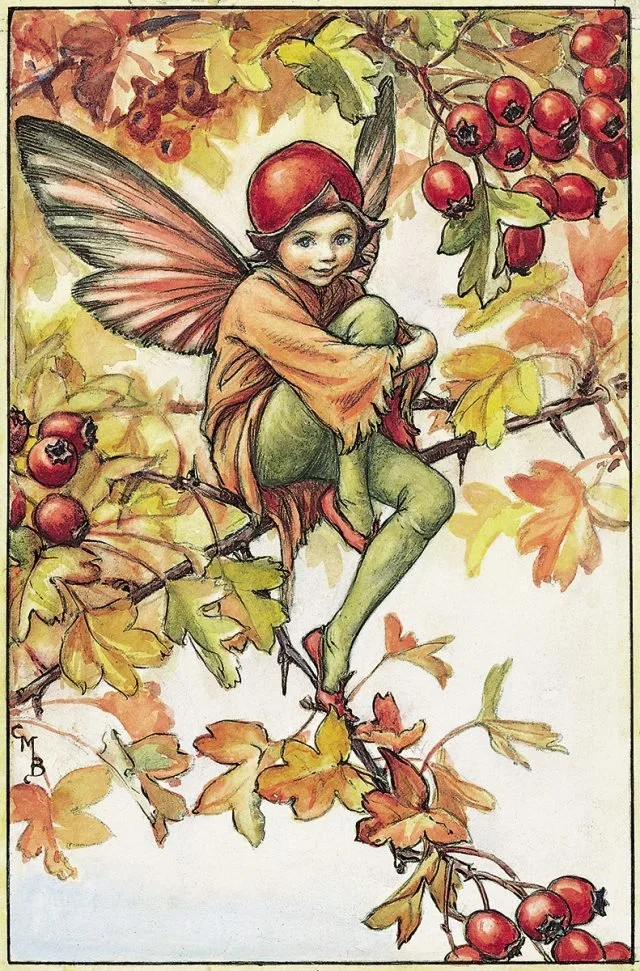
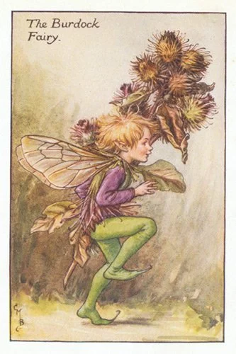
Cicely Mary Barker flower fairies
Big crush on Walter Crane’s beautiful and deliberate art nouveau linework and framing, symbolic borders, symmetry and fairytales. In love with it all.
Walter Crne “Woodnotes’
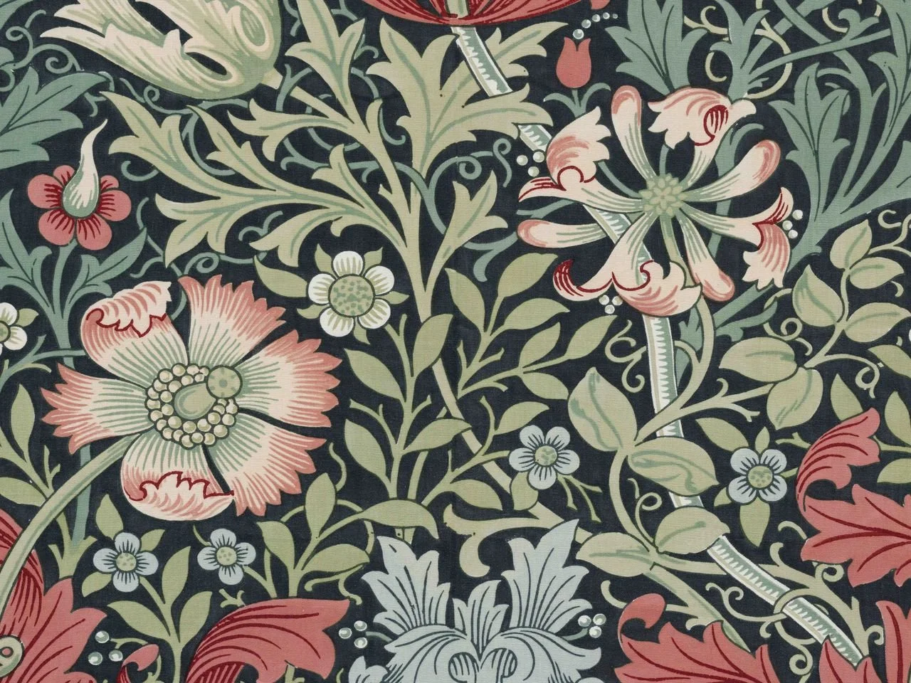
William Morris ‘Compton floral’
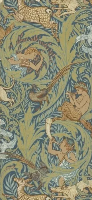
William Morris pattern designs are hugely influential on my work-the lovely meshing together of botanical illustration and clever, wonderfully structured repeats of a tiny scene really float my boat. Taking the shape and feeling of a bird or a plant and allowing it to transform into decoration, to weave in and out of its habitat……drool.
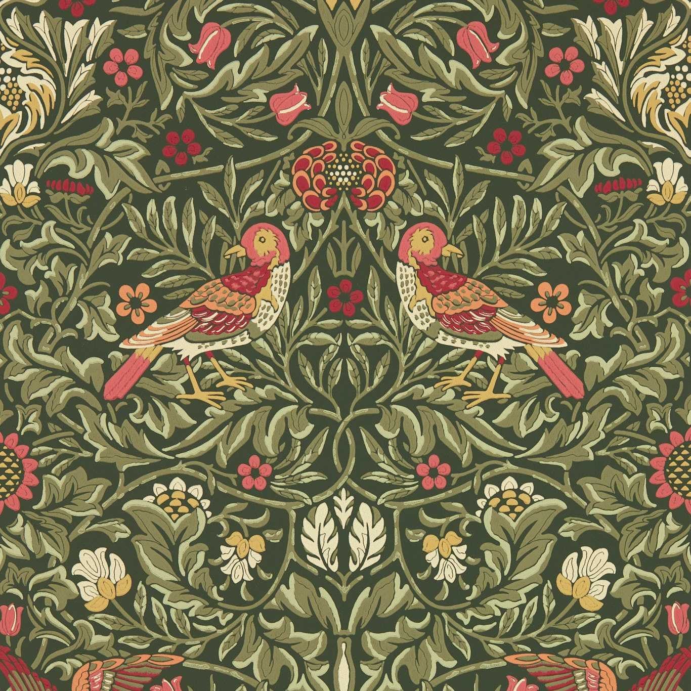
William Morris ‘Bird’
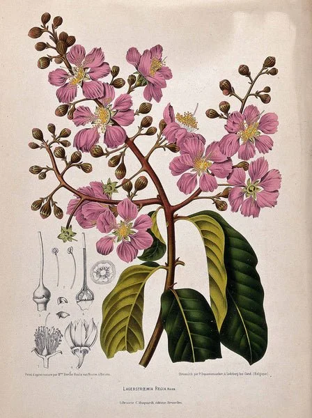
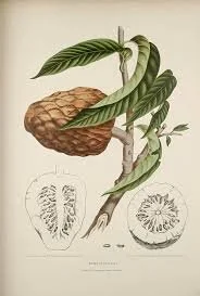
Berthe Hoola van Noote’s exquisite colours-tropical, exotic and indigenous botanicals-introduced flowering trees, shrubs, decorative flowers and plants with edible fruits. Each illustration accompanied by a description of the plants and their culinary, medical and other uses. Utter joy.
Line art verses realism is the next port of call. I have two distinctive ‘Karis’ styles currently, and I love working in both. In this case, line art. This decision depends on the audience and context of the final art. I want something whimsical and nostalgic, which could be appreciated by adults and children……so likely more illustrative than artistic…..and must fit nicely onto an A4 format and translate a little smaller and a little larger (poster size and greeting card size).
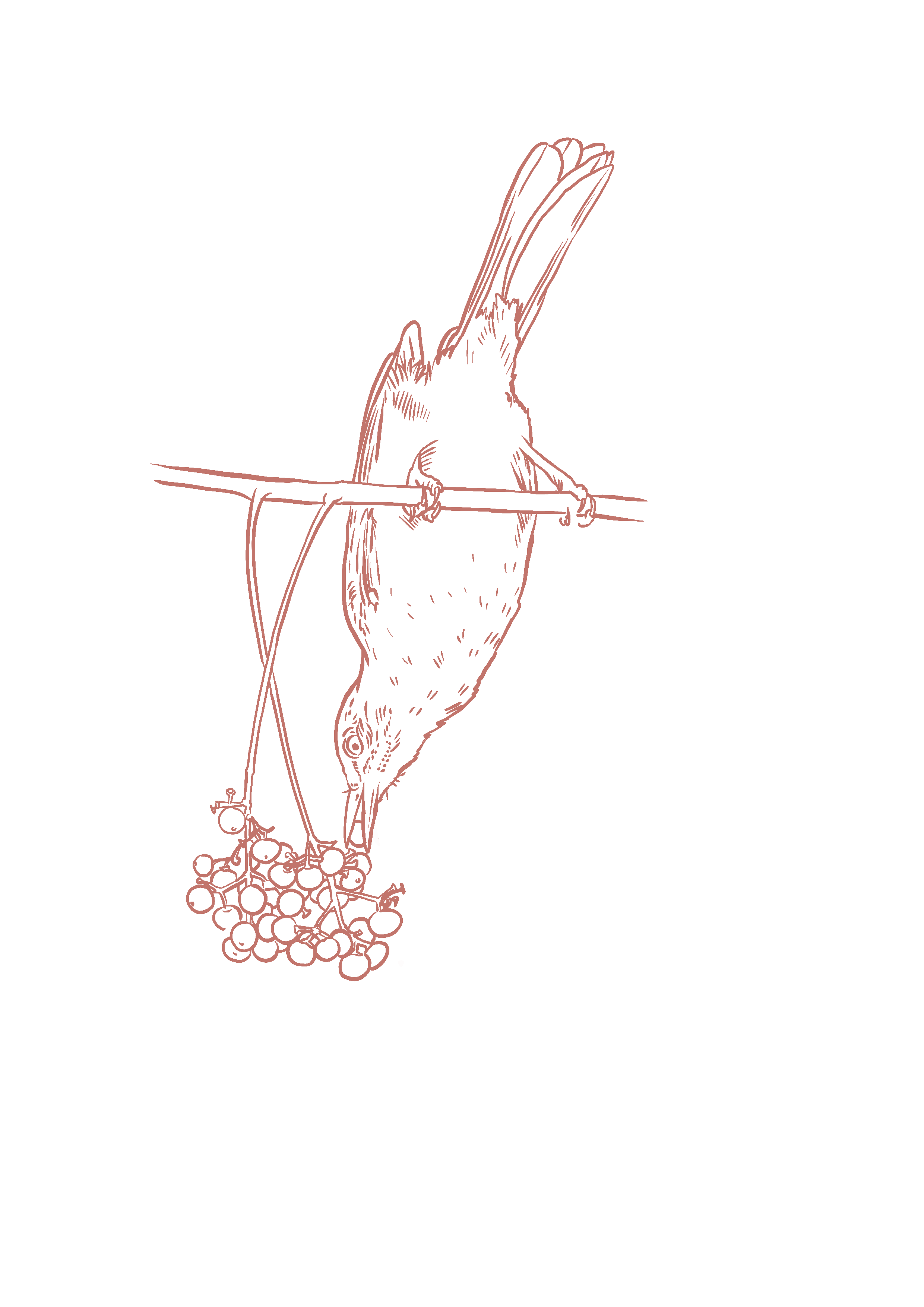
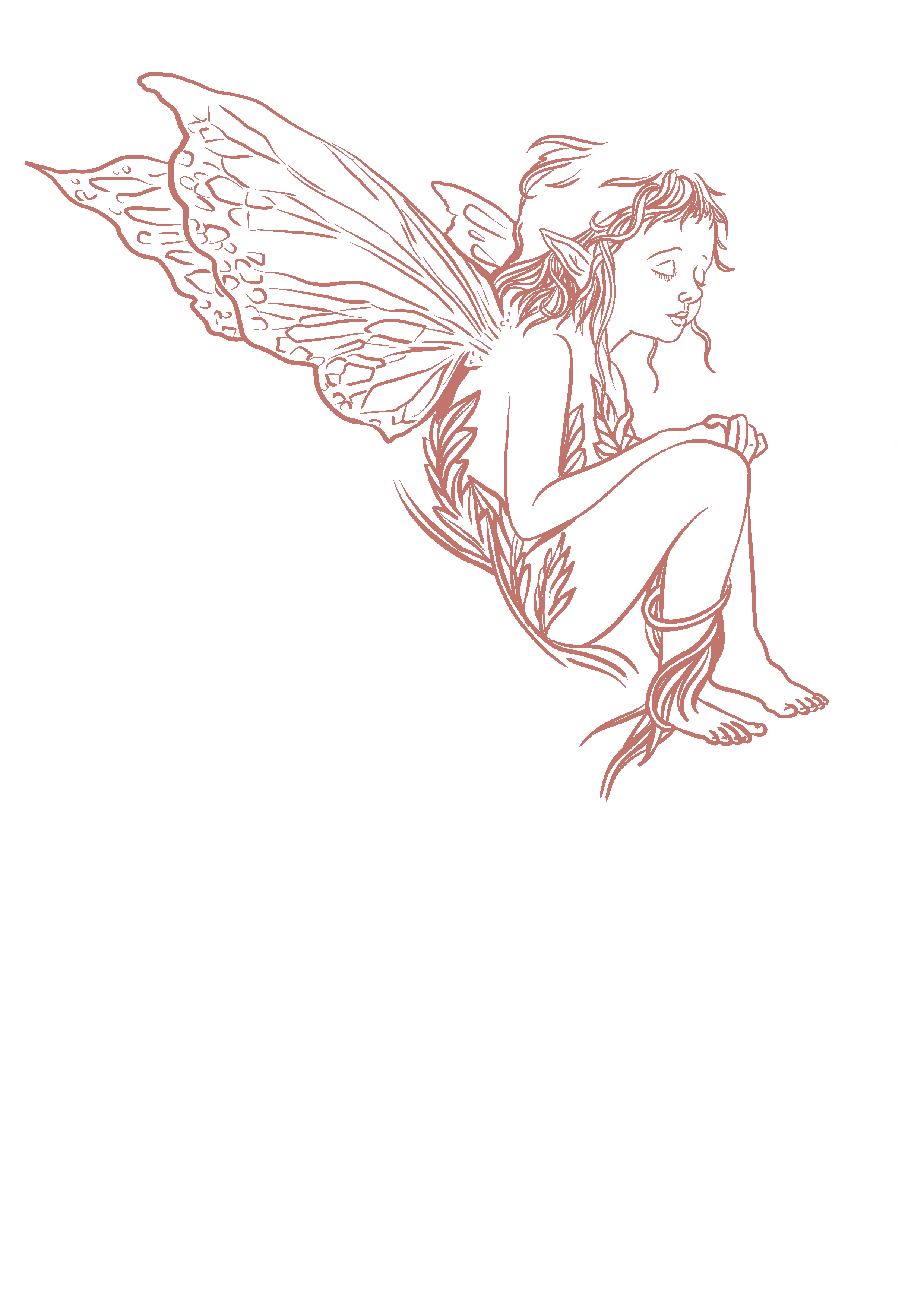
Some of the isolated drawn up items below-I often draw up separate elements before collaging them together onto my final design. This gives me freedom to edit size/placement etc.
Use of one or two brushes for line work-I like to retain a consistency and cohesiveness by limiting the pen style and size. I used a default procreate syrup ink brush only for this piece, and only the text has a slightly thicker line.
Typography. A choice of three staple fonts I play with on a regular basis (I chose one font as only a title font required. I love the antique, flourished lettering of this one-decorative but still nicely legible). I wanted the text to interact with the surrounding illustration, so little vines weaving in and out of letters, and a few overlaps. This can make such a difference to an overall design, my pet peeve is ‘plonked text’ which hasn’t been thought about as a whole. The text isn’t separate, it’s part of the same world and I want it to grow in and around this world.
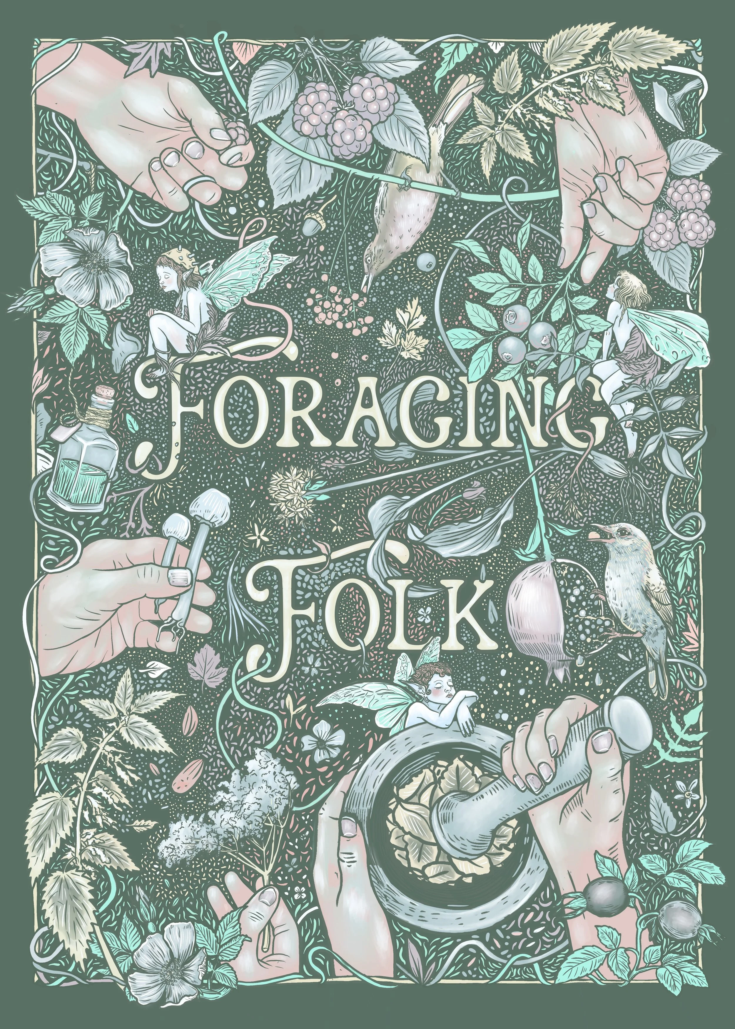
Texture; I do usually add some sort of paper texture over flat illustrations to add depth and give them a more vintage feel, in this case I also added highlights on a separate layer over the top for extra contrast.
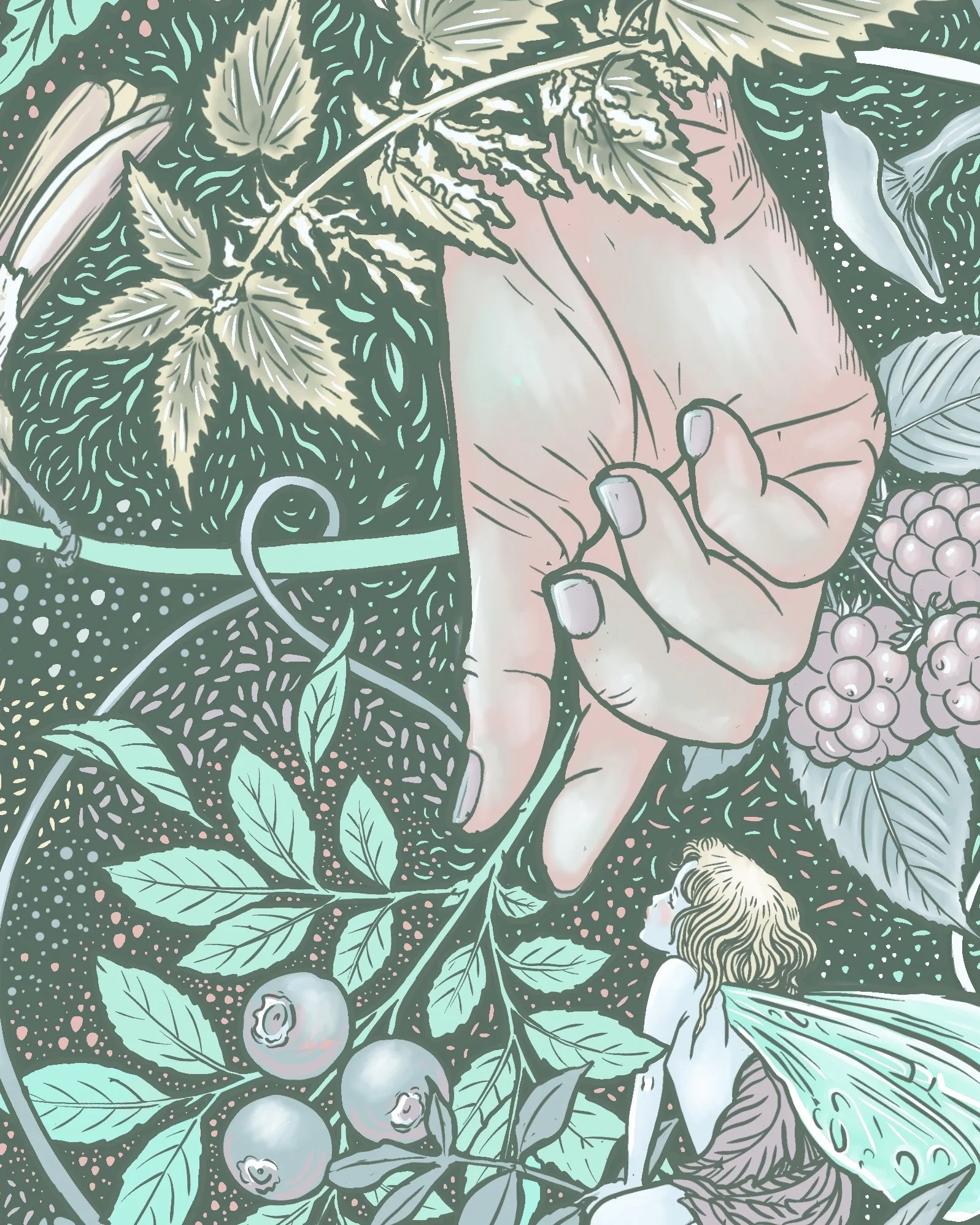
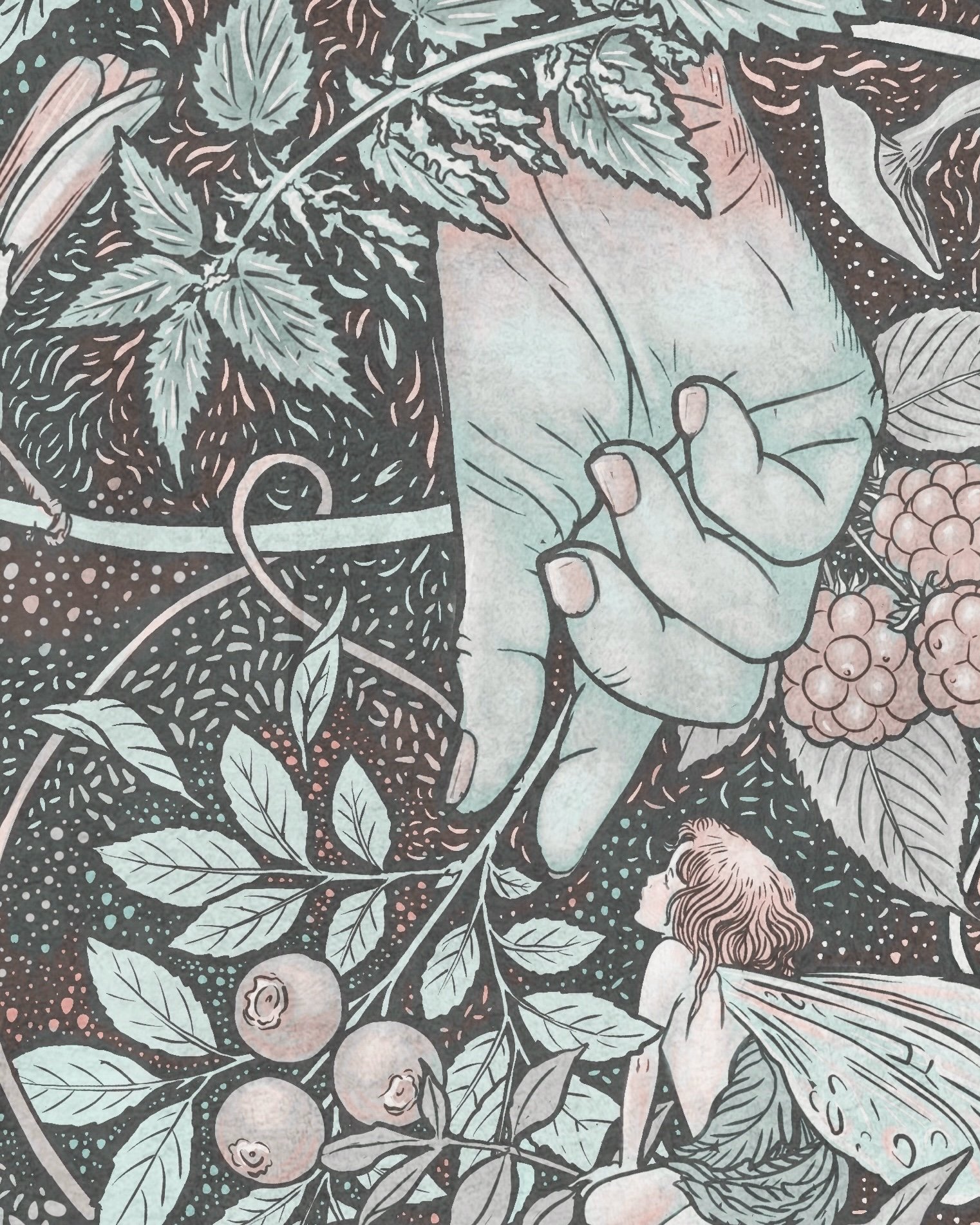
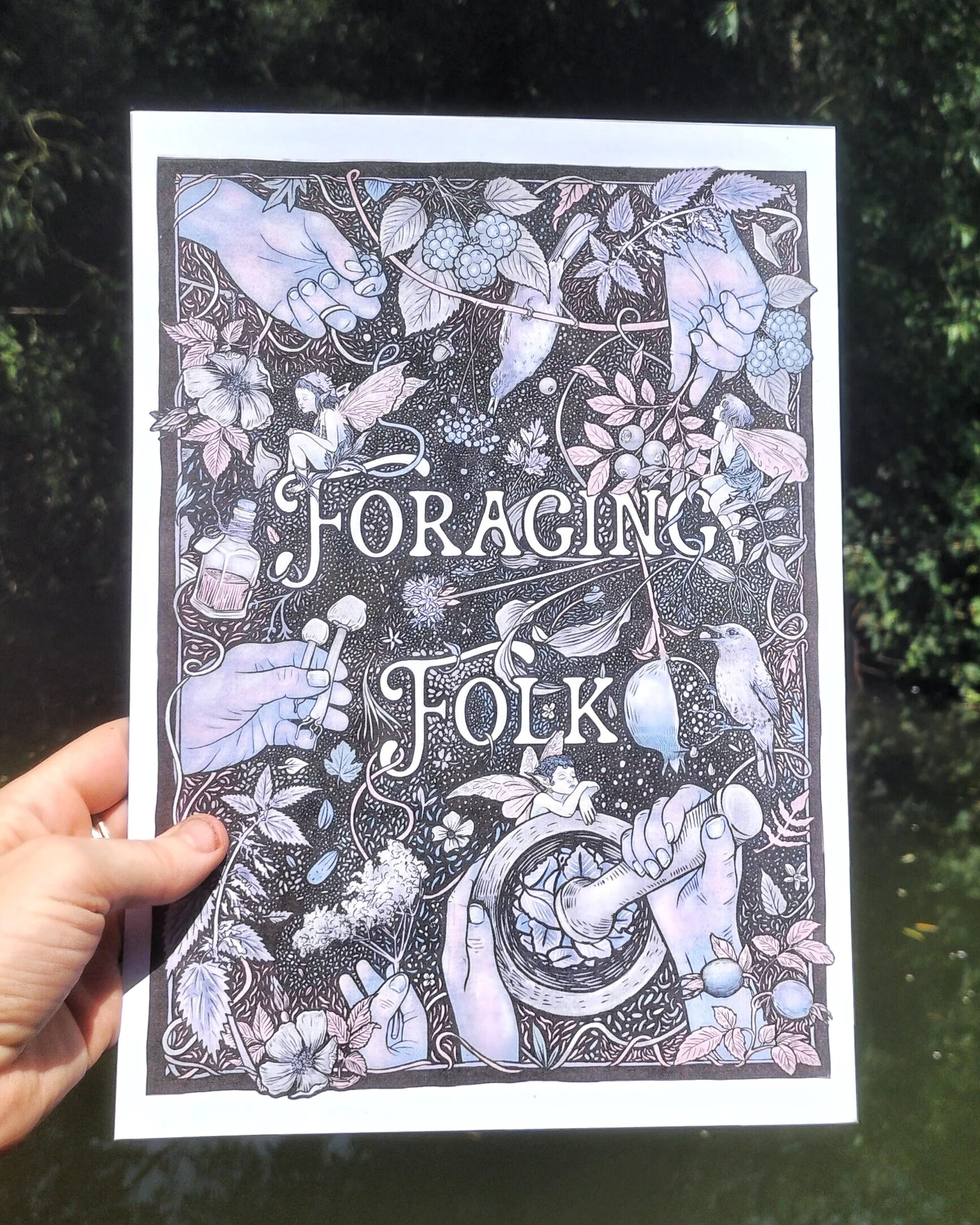
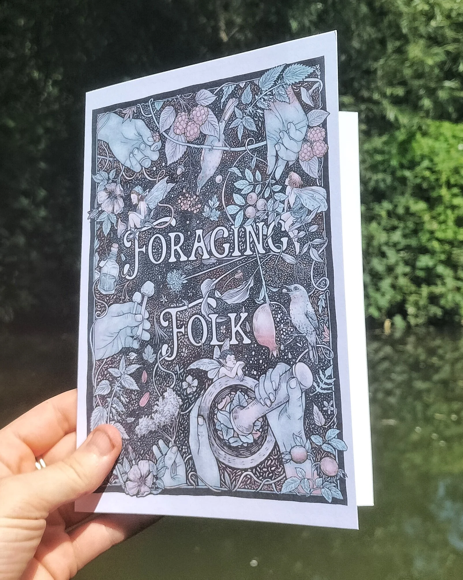
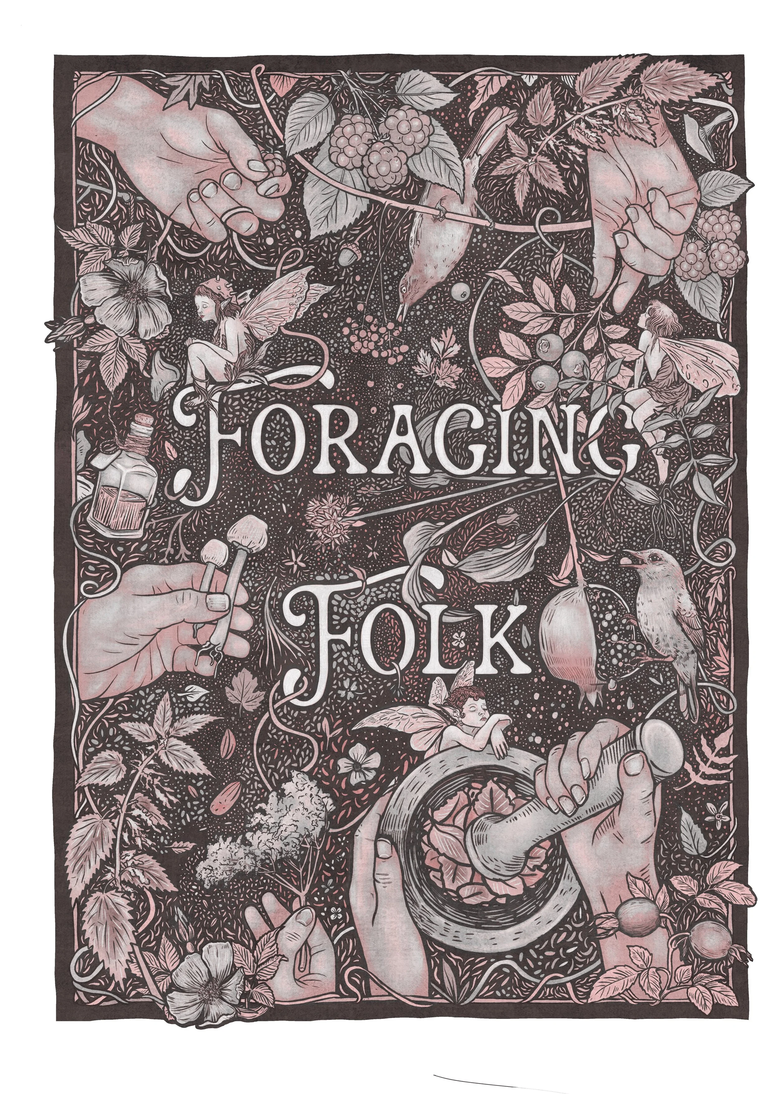
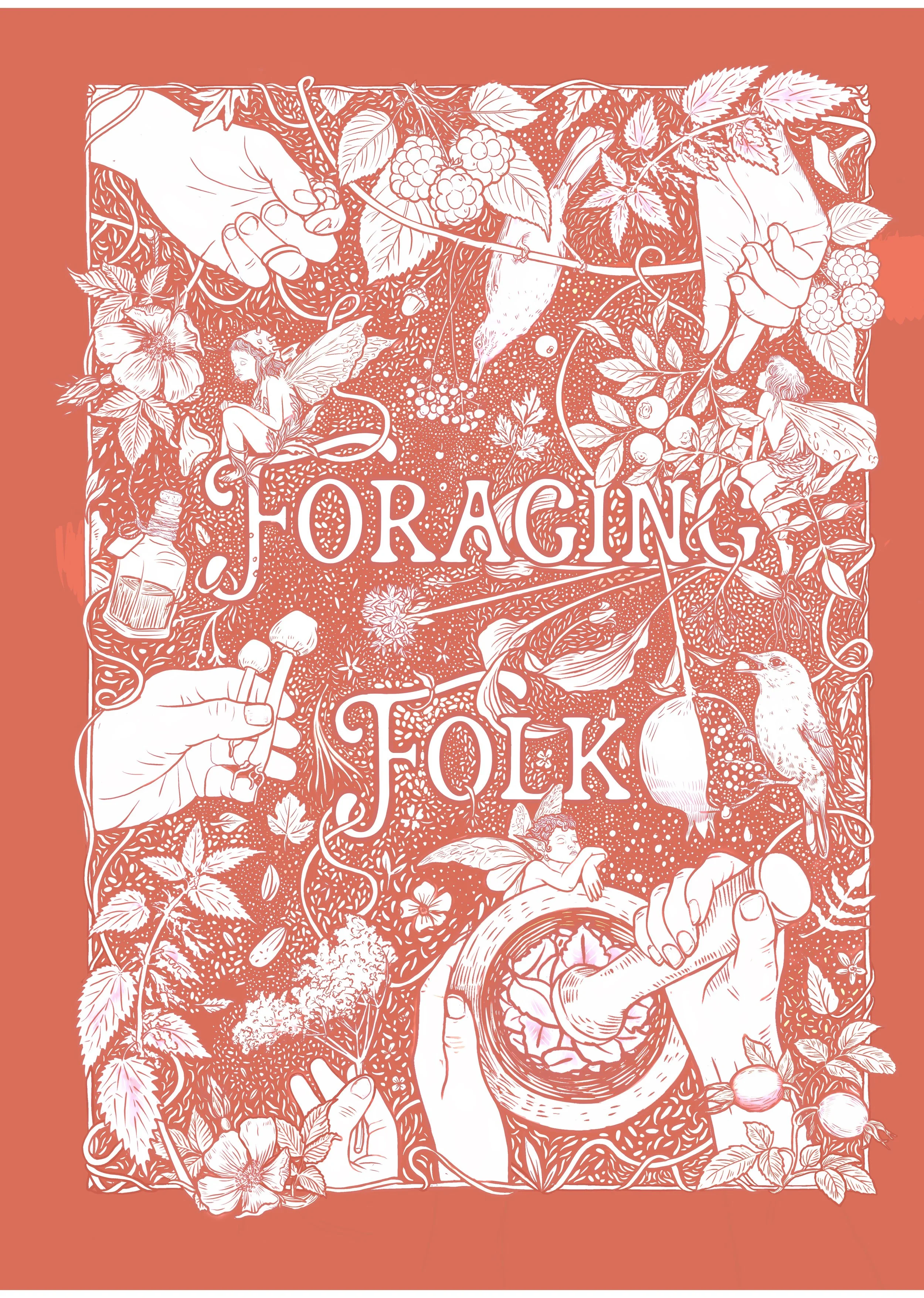
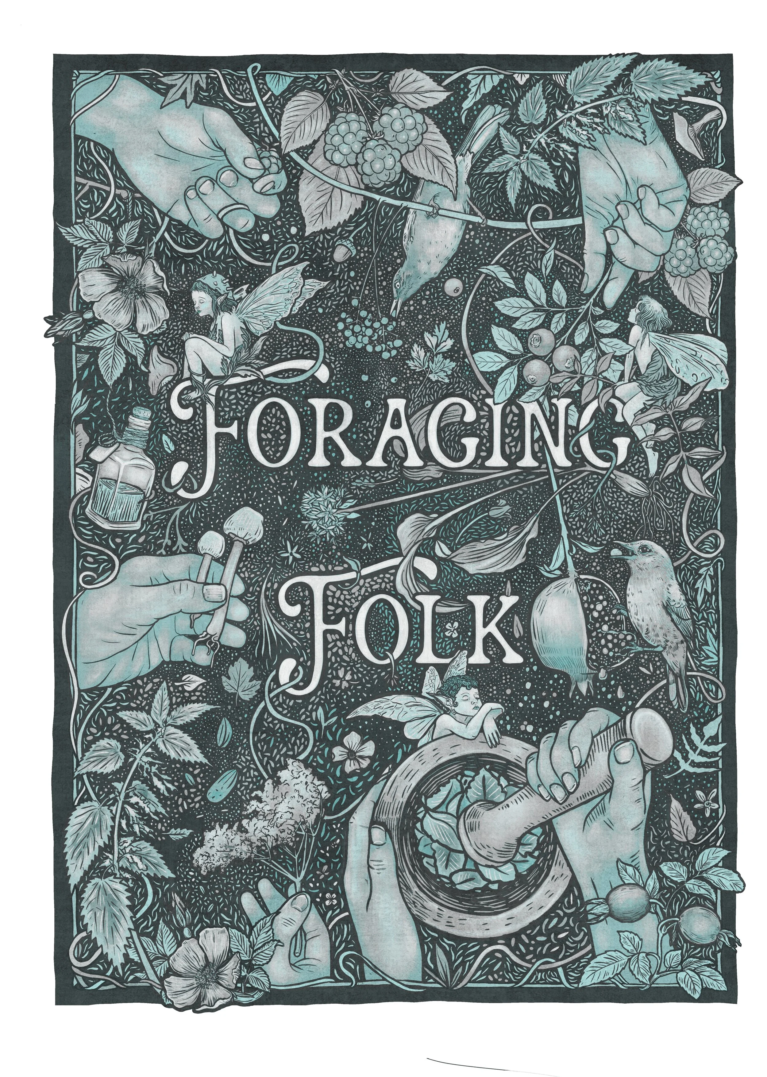
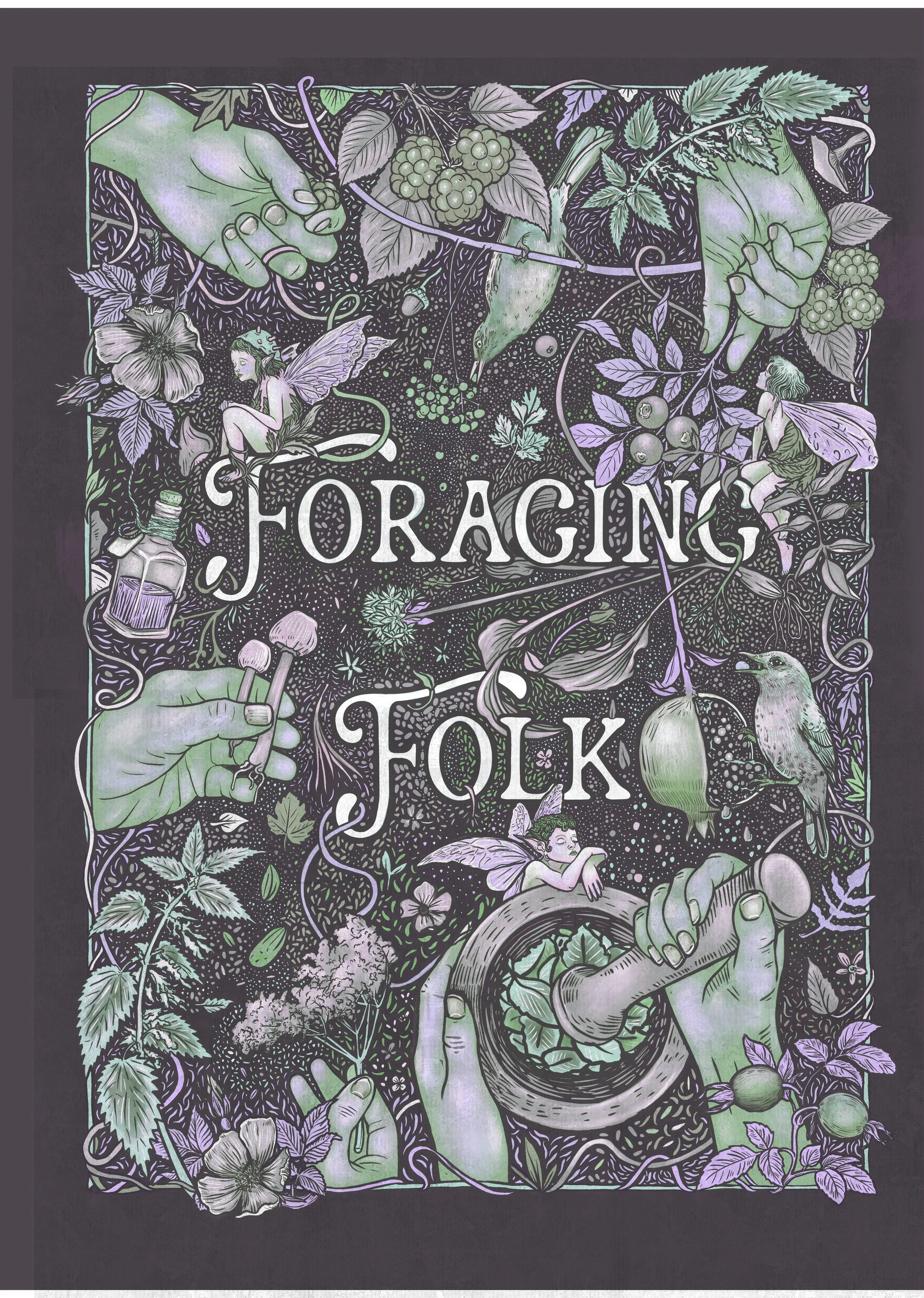
My nemesis is colour-way choice…….but, as with this illustration, I have to decide early on whether the ink will be a select few colours or uniform. All of this can be edited later on, but does affect the way I build the elements up. Once I’d drawn everything up it was playtime in this department, as you can see flicking through the carousel, this was where my editing and limiting head fell off and rolled far away into an endless kaleidoscope of uncertainty until I eventually came back to my inspo silos and remembered the subtle, vintage palettes I’d originally favoured, reeled myself back to reality and out of colour bedlam…..
A gazzilion colourway experiments below
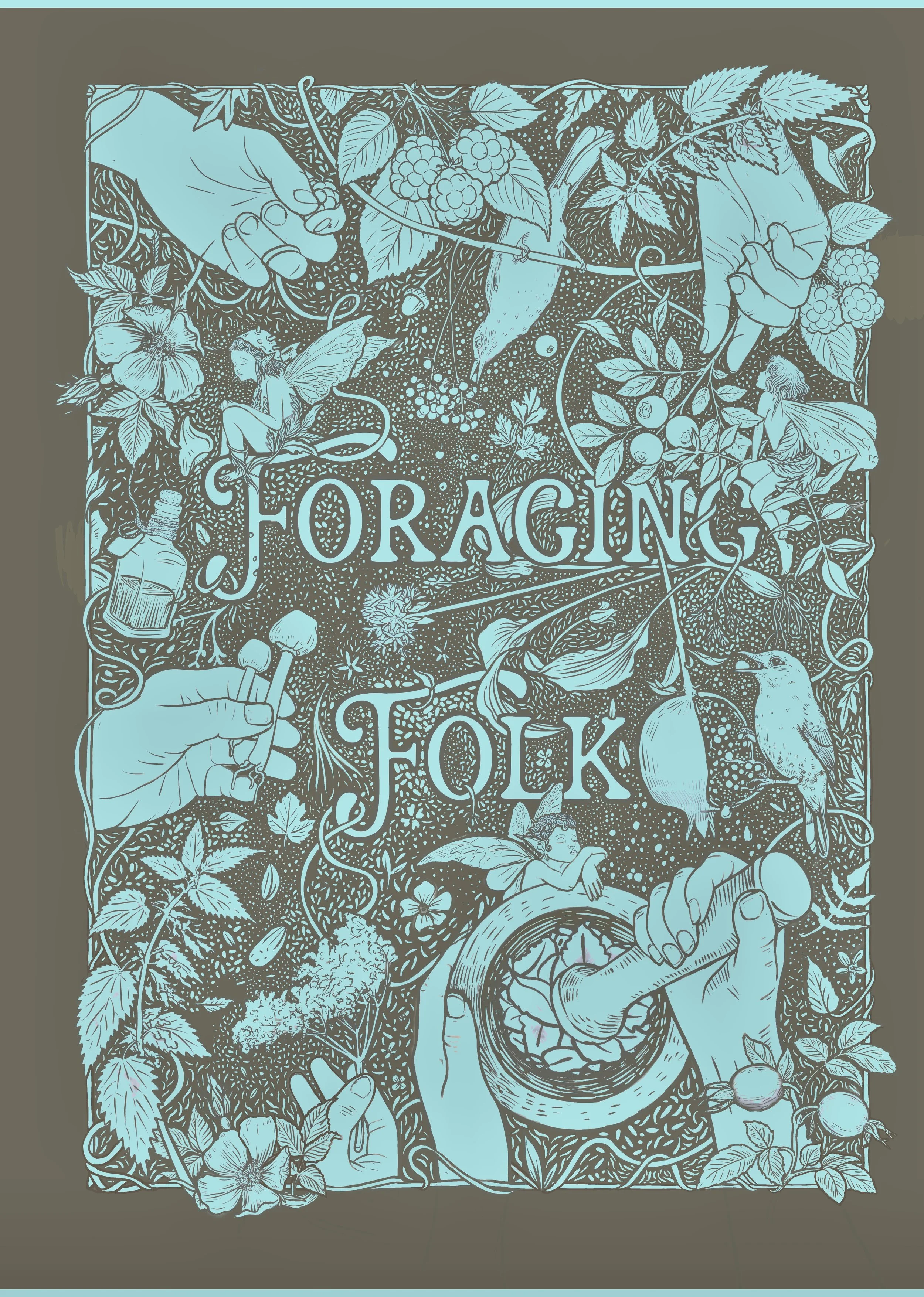
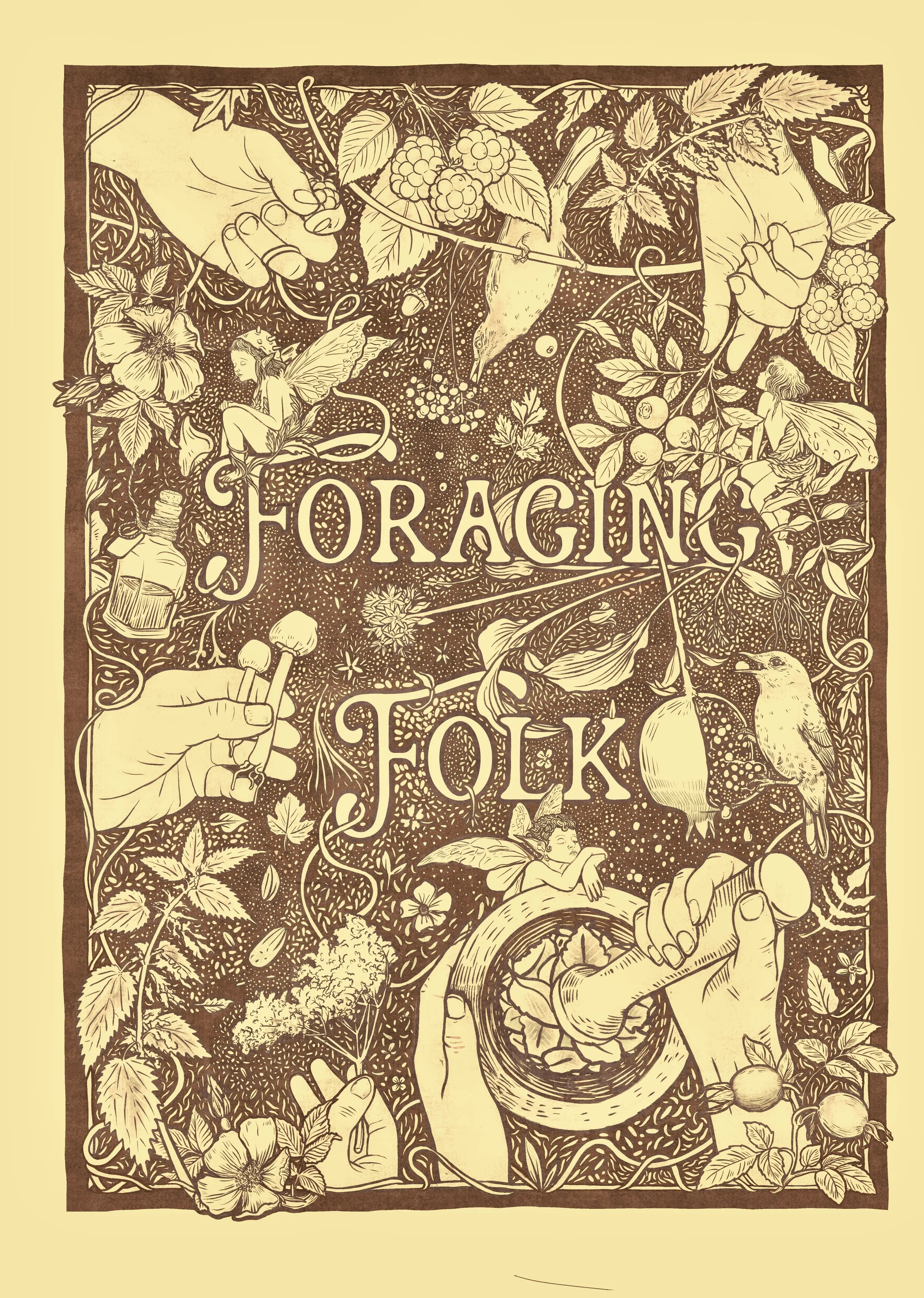
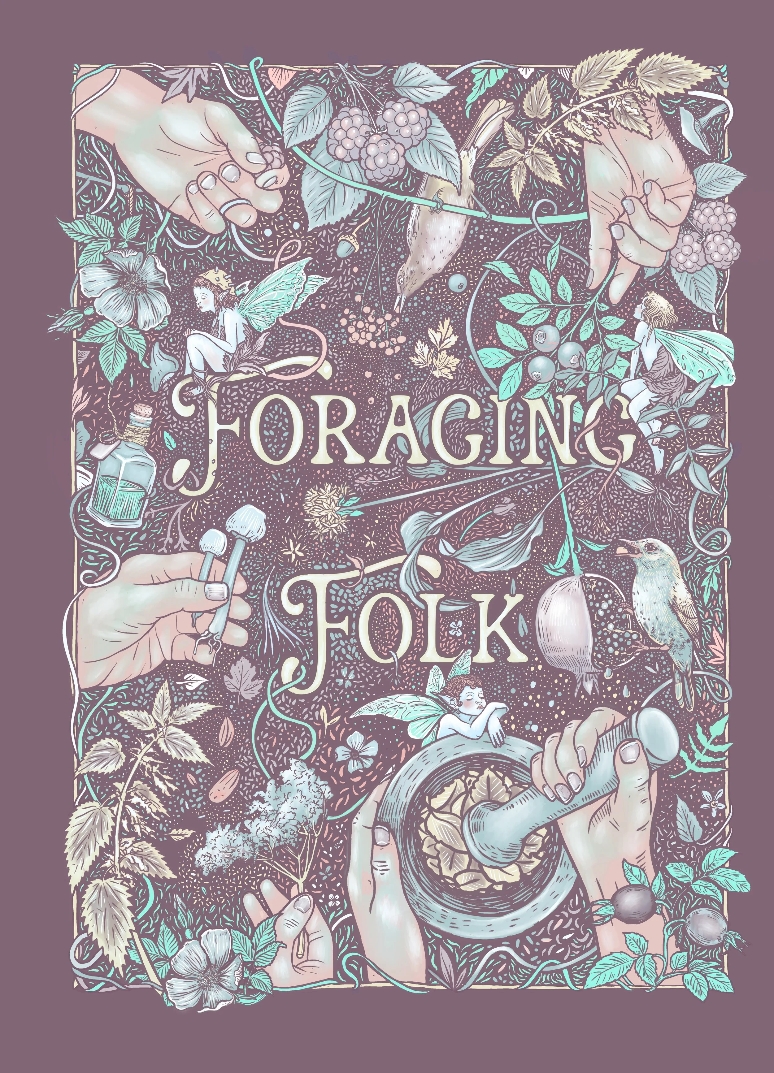
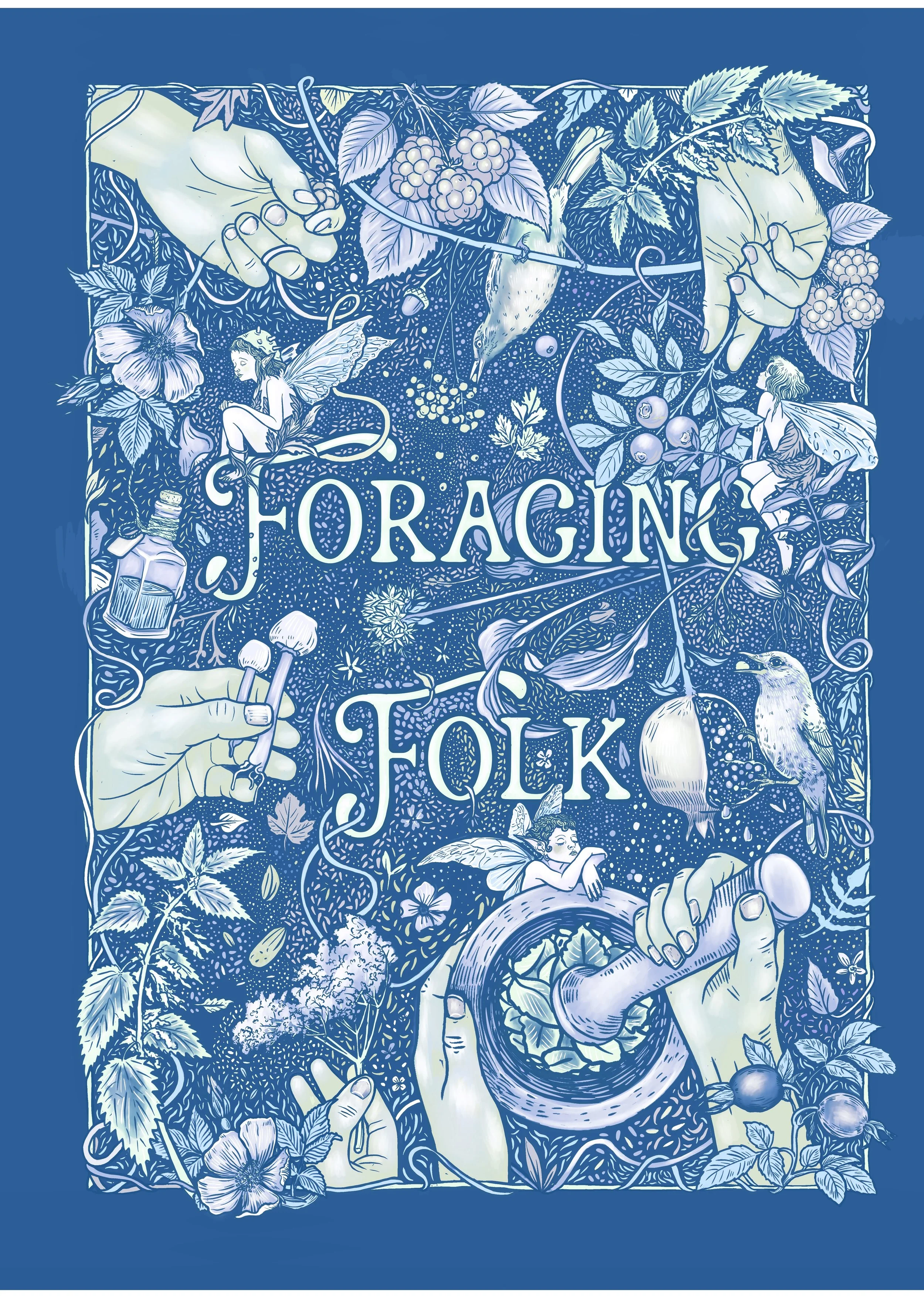
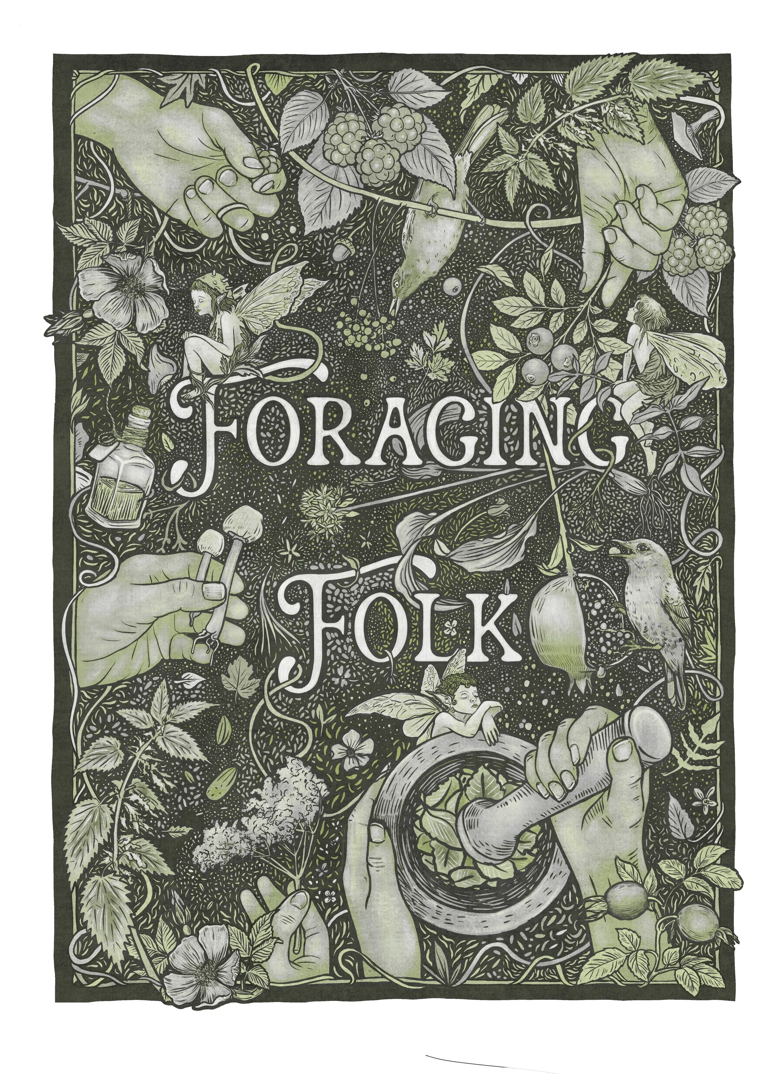
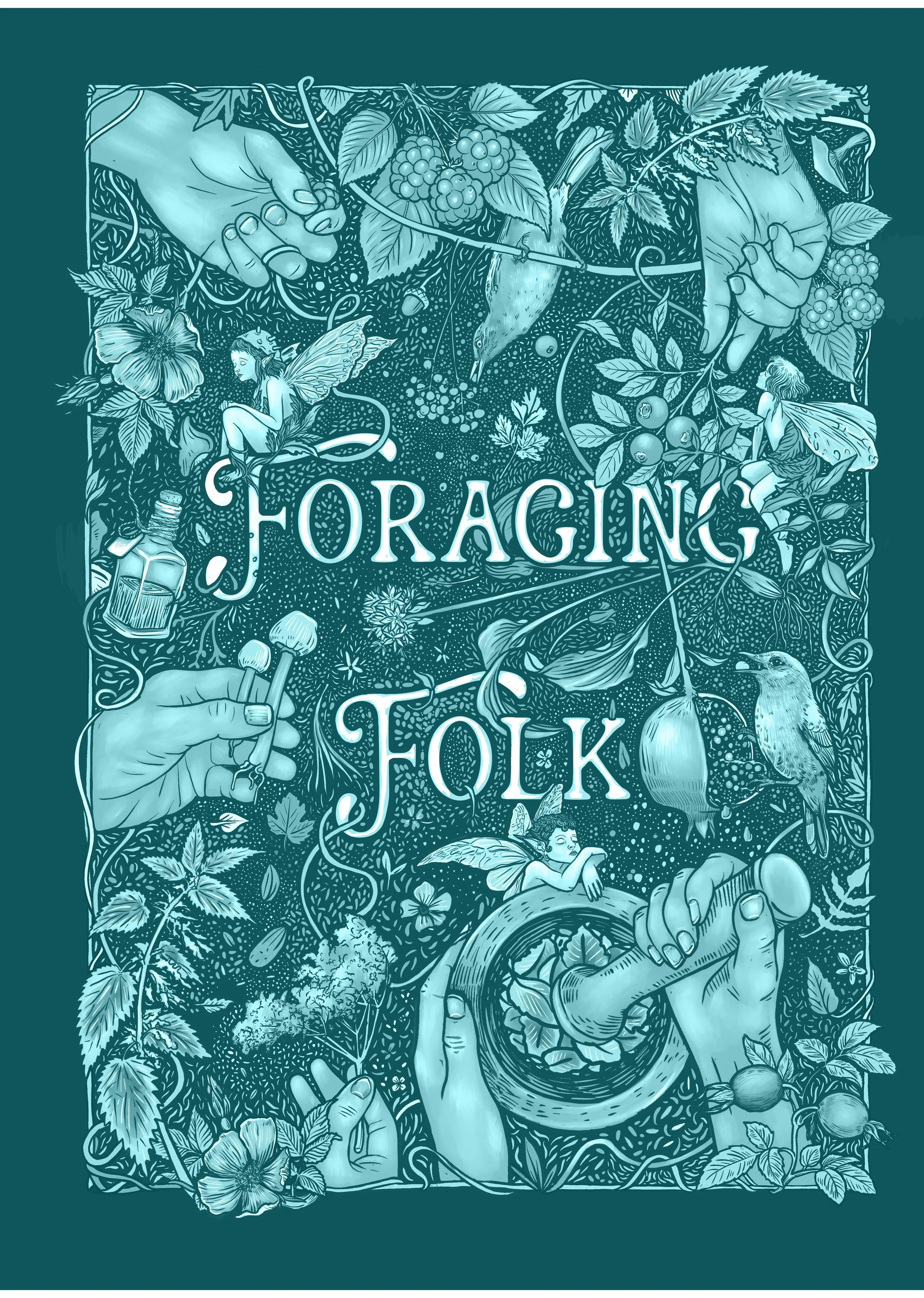
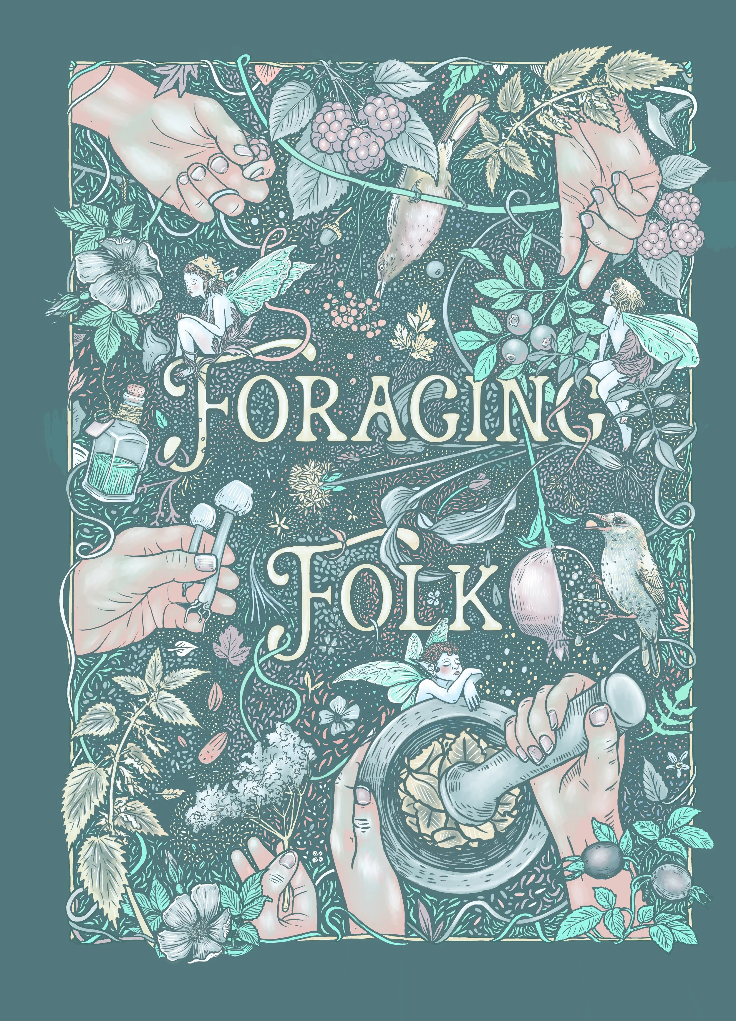
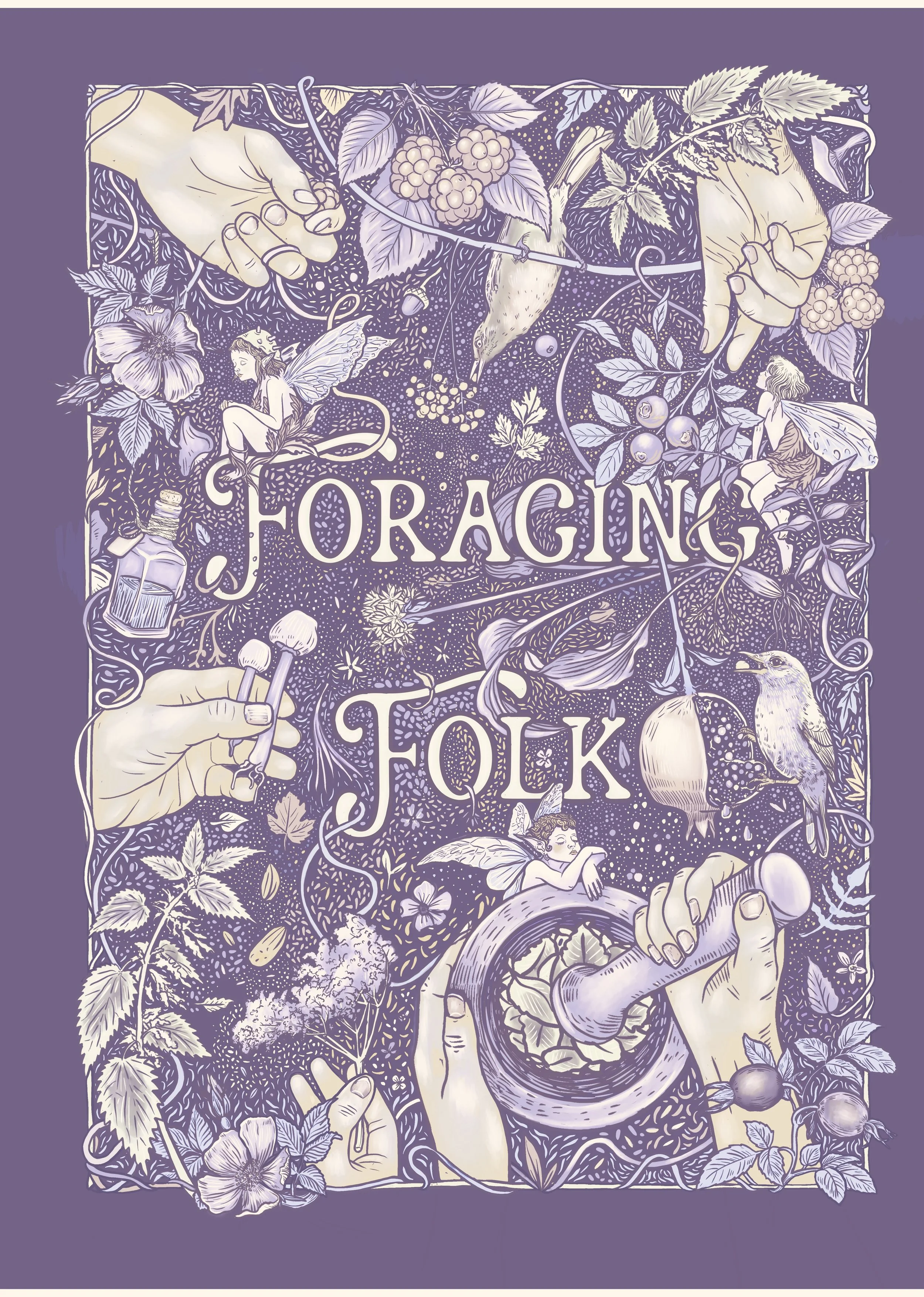

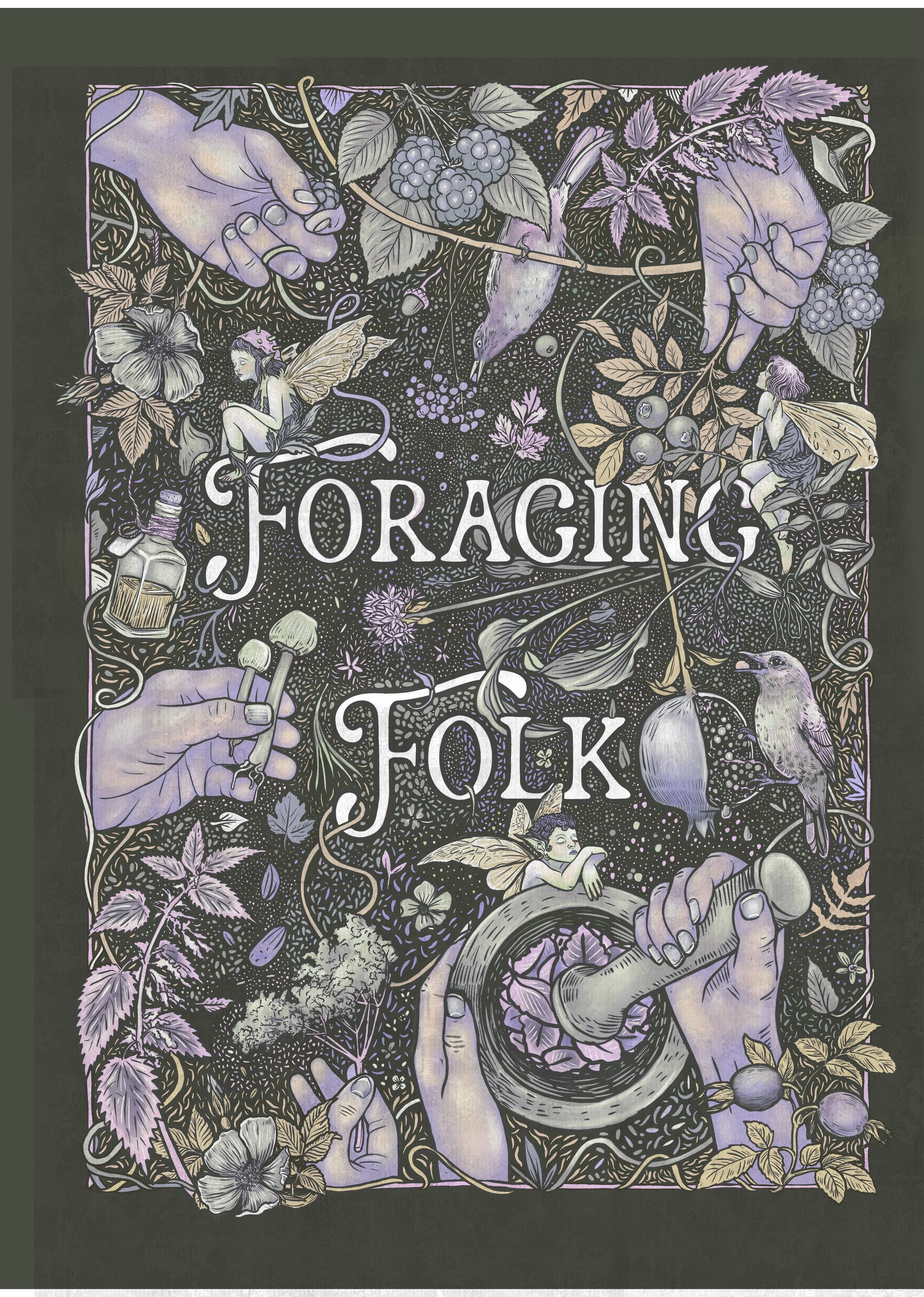
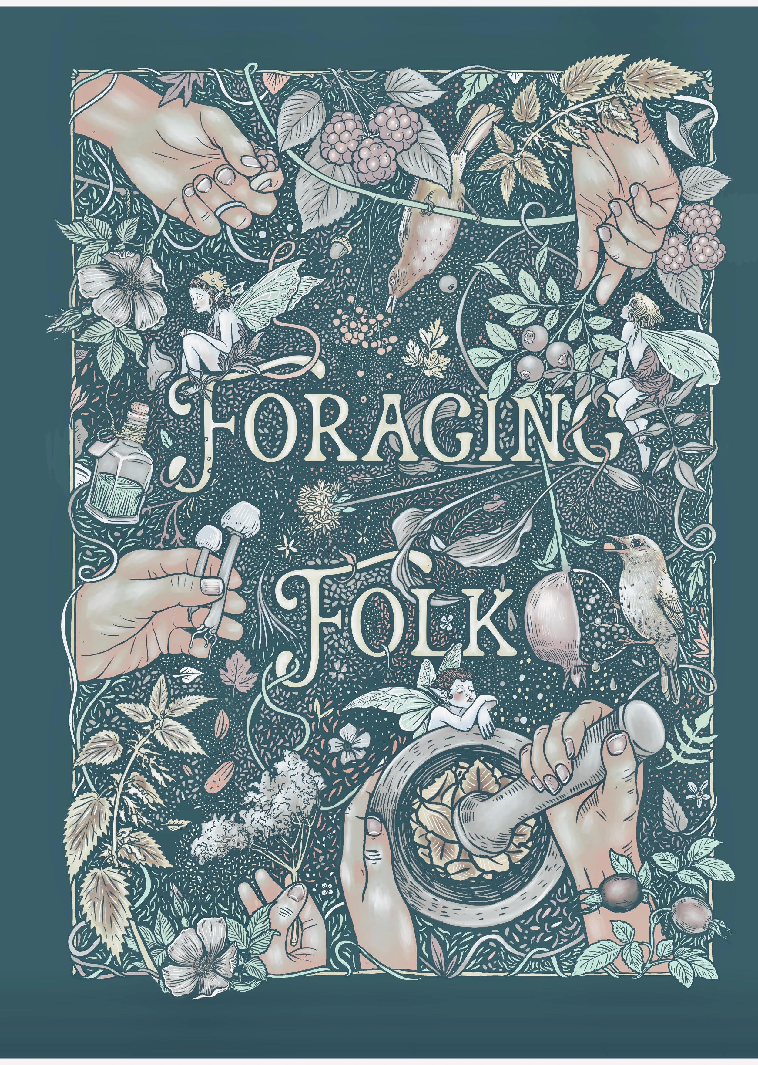
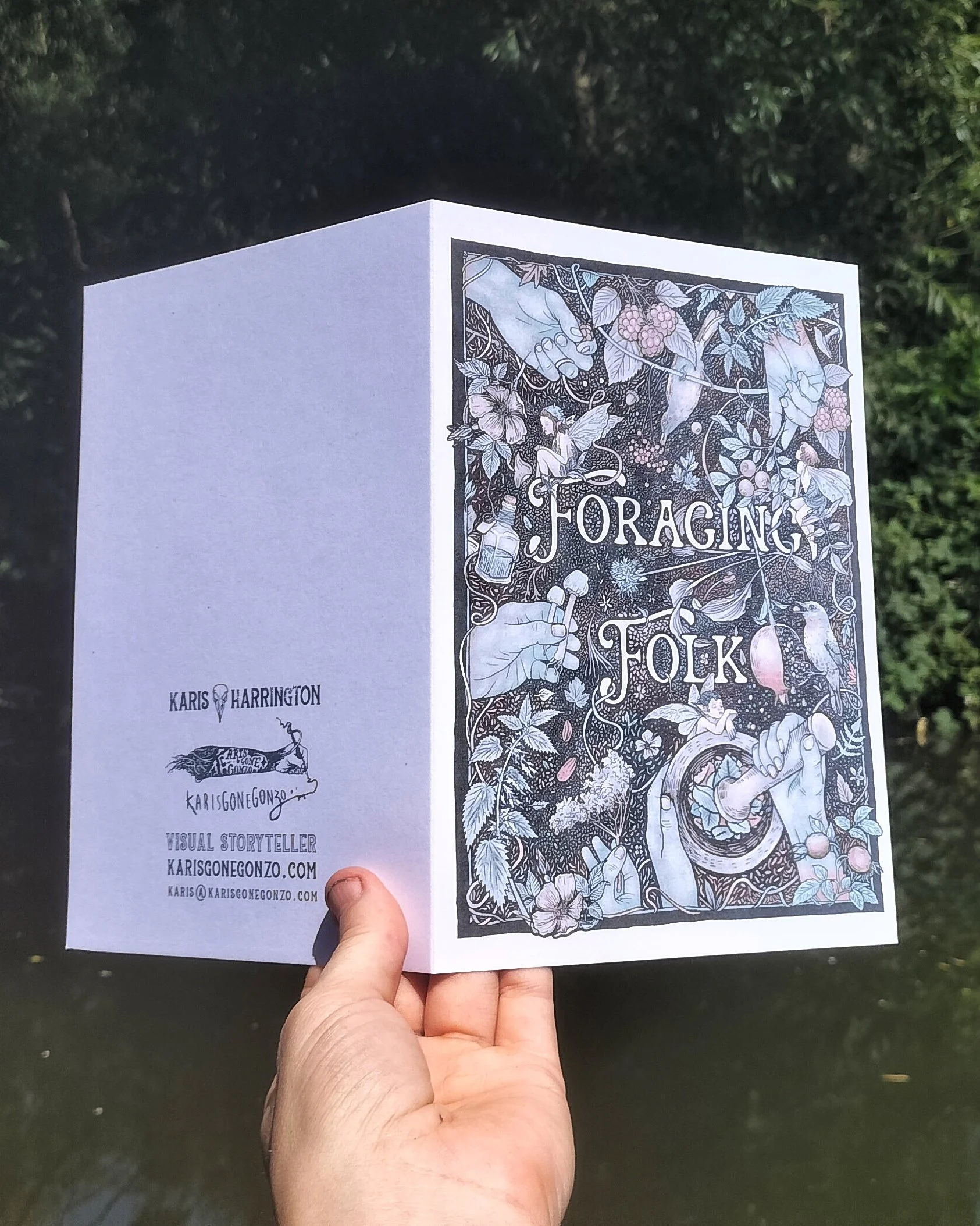
Final poster prints on A4 and A3, as well as greeting cards A5. Two chosen colourways (yep still couldn’t just pick one…..)
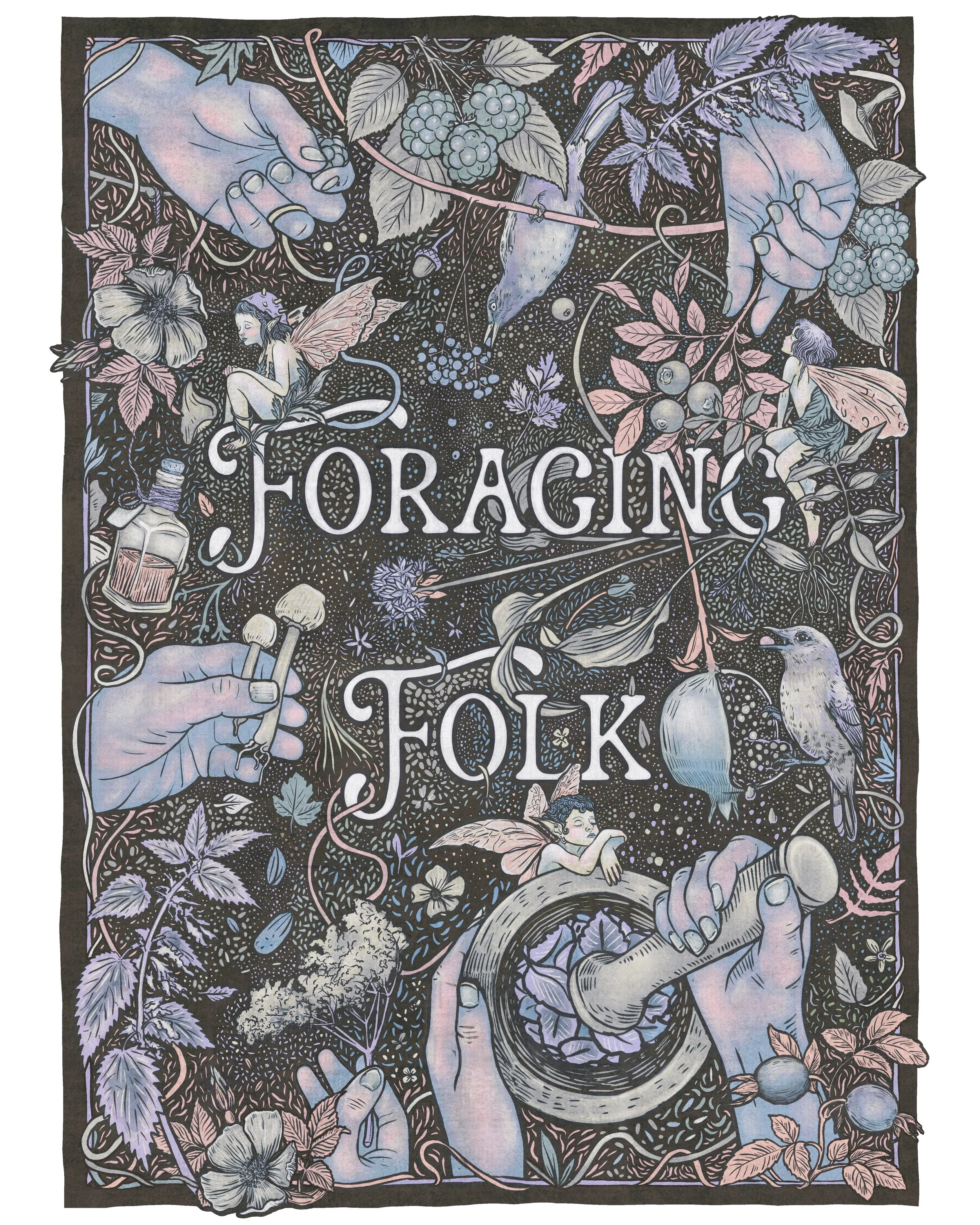
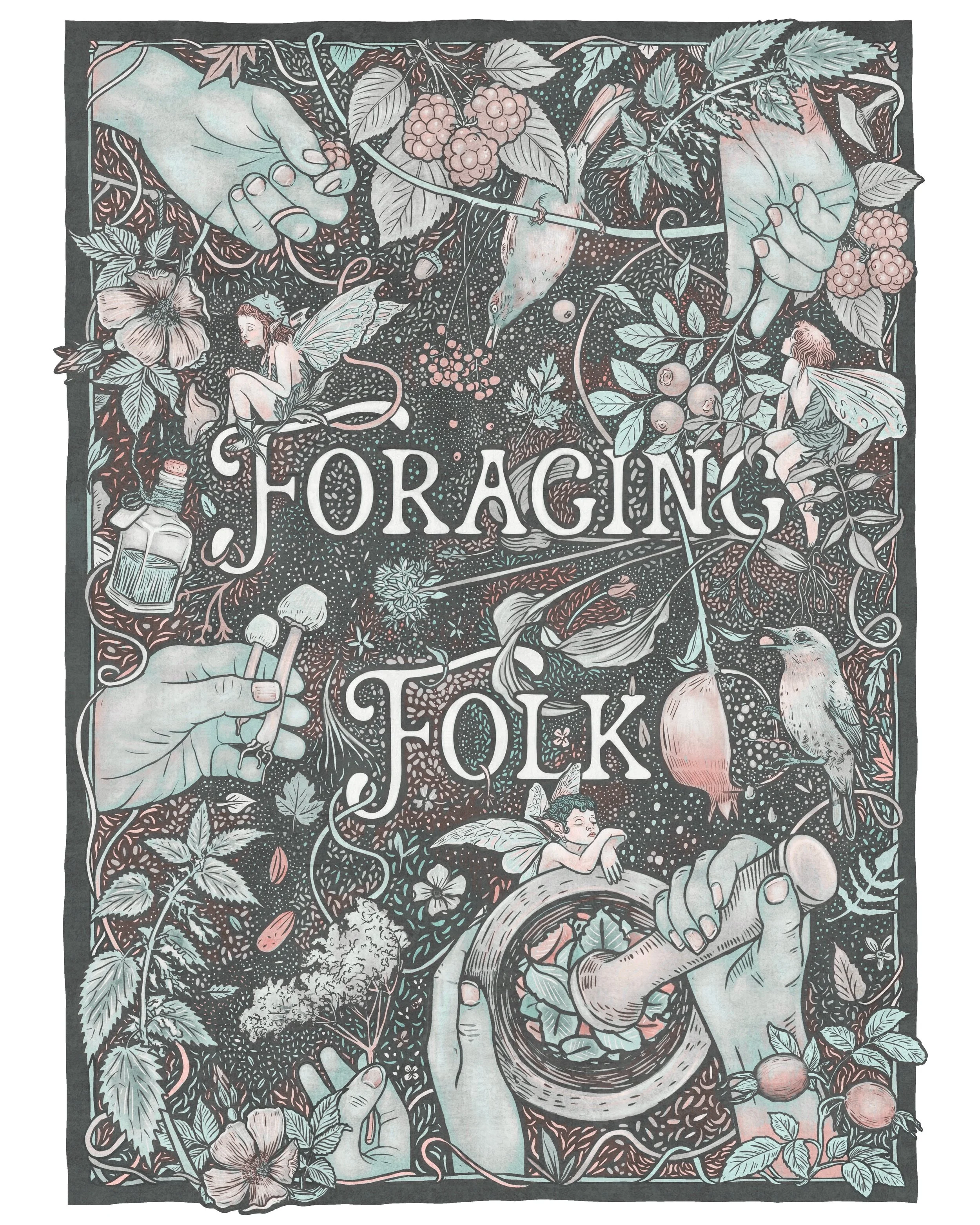
Happy with the final poster prints, and happily surprised no details is lost even at A5 on the greeting card. I chose the brown/lilac tone for the A4, sometimes just nice for another version to exist…..